Hi there, Developers 🖖 Welcome to the last post of the year! Phew, what a year, huh? Apart from all the negative impacts of the COVID in the entire world, I wish you could have had time-off from your crazy busy work/study routine, have had the time to realize what your true values are, and most importantly, to appreciate the real and simple things in life!
As announced a couple of weeks ago, the Welcome, Developer team has released our first project 🎉 It’s a React boilerplate app built using TypeScript and Material Design!
The goal is to provide us with a good start point in future posts’ exercises, and mainly, to encourage you to use it for learning purposes and/or for when starting your own React applications!
Today’s plan for us is to go through the application together! Some steps might be pretty straightforward to follow or even sound repetitive for some of you, but hopefully, it’ll be useful for people in the future just starting out.
Okey-dokey, shall we start then? As I always say, grab your favorite drink (no judgment here 🙂), and let’s get our hands dirty!
Table of contents
Open Table of contents
Introduction
On this project, React is our choice when it comes to a JavaScript library! I’m a big fan of it, I have to say. Although, the decision of what library to use and what subjects to discuss here at our blog, is never about my personal preferences but always about trends and popularity.
React is an awesome library to work with! It enables you to very quickly find yourself already building components and highly motivated to explore! The official documentation is excellent and has everything you need to start developing your apps!
When coding a React app, we can choose between using JavaScript and/or TypeScript. If you wanna hear from my personal experience, I used to only use JavaScript with my React apps. However, since I started using TypeScript, there is no turning back! Pay attention to this description of TypeScript:
“TypeScript is a programming language developed by Microsoft. It is a typed superset of JavaScript, and includes its own compiler. Being a typed language, TypeScript can catch errors and bugs at build time, long before your app goes live.”
— React Documentation
It does sound very convincing, don’t you think? Catching bugs before the app goes live? Sold, I’m in!
Honestly, it helps quite a lot with those runtime errors when a variable hasn’t been declared, or the assigned value doesn’t match with its type, and the list goes on! Based on those reasons, we can understand why the popularity of TypeScript has only increased in the last couple of years!
Alright, so we’ve got React and TypeScript so far. What about the Material Design?
Material is an open-source design system built by Google. It consists of a collection of guidelines and principles to design and create user interfaces (UI). You can find it when you access your Gmail, for example. It’s pretty cool and enables us to build beautiful UIs! To have it applied to our React application, we’re going to use the Material-UI component library. If you haven’t heard about it before, check out the list of cool components available! Throughout the post, you will get yourself familiar with how to implement those Material components into the React app!
Enough talking, right? Let’s get to work, developers 🔨
Environment Setup
In case you still don’t have Node.js installed on your machine, download the current version from the official website, or using any other method of your preference such as nvm. Once it’s been installed, run the npm command to ensure it’s all good to start our exercise. You should be able to see the list of commands available.
Create React App
With the environment ready, let’s start and create our React app. The easiest, and most recommended way, is using the create-react-app command:
npx create-react-app welcomedev-react-starter --template typescriptBecause we’re using TypeScript on the application, we must add the typescript template to the creation command. It creates an additional file called tsconfig.json on the root of the application, which has the responsibility of specifying the root files and the compiler options required by the project.
Once the app has been created, navigate to its folder location and start it to ensure there are no errors (just in case!):
cd welcomedev-react-starter
yarn start
All good? React logo spinning? Let’s move on then, guys ✅
This step is optional, so it’s up to you to do it or not. I’m going to remove the files we won’t be using:
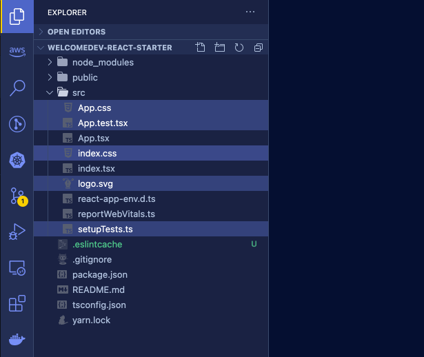
In case you have also deleted the files highlighted above, do remember to remove the references to them in the App.tsx and index.tsx files, okay? Great, next step!
On the App.tsx file, let’s clean it so we can start building our app:
import React from "react";

function App() {
  return <></>;
}

export default App;
Cool, no distractions anymore. In the next section, we will start creating the React components of our SPA application!
TypeScript Components
If you have followed our previous posts on React, you will notice that the components we are creating here look a bit different from the others built using JavaScript. That’s because the purpose now is to use TypeScript whenever possible, getting good benefits such as type-checking errors!
Let’s start, developer. First of all, create a new folder called components under src. Then, create a TypeScript JSX file (.tsx) called Header:
import React, { ReactElement, FC } from "react";

const Header: FC<any> = (): ReactElement => {
  return <div>Header</div>;
};

export default Header;
Good, we’ve just created a Functional Component (FC) that receives an object of any data type and returns a new React element (a div in the example).
Okay, got it. But it won’t be much useful the type checking functionally of TypeScript if we use the type of any, do you agree? Time to start creating interfaces to represent objects! An interface is an approach used to create contracts within our code, so every part of the application (as well as us, the developers) knows exactly what properties and data types to expect!
What about we have a quick pause now, and have a read at interfaces on the TypeScript documentation? The concept can get quite complex but don’t worry, only the basic level is explored in our app.
Ready to continue? Nice one. Back to the Header.tsx component, create the Props interface to represent the properties that the component receives as parameters:
import React, { ReactElement, FC } from "react";

// define interface to represent component props
interface Props {
  title: String;
}

const Header: FC<Props> = ({ title }): ReactElement => {
  return <div>{title}</div>;
};

export default Header;
Shall we check our TypeScript component in action? On the App.tsx file, add the reference to the recently created component:
import React from "react";

import Header from "./components/Header";

function App() {
  return (
    <>
      <Header title="React App" />
    </>
  );
}

export default App;
Start the development server, and check if the value of the title property is printed on the browser. Is it? Great, you have just learned the basic logic of every functional component we will be creating throughout the post 😎 Piece of cake, don’t you think?
So far so good, my friends! Moving on to the next chapter!
Material Design UI
The goal is to build the user interfaces (UI) of our React application with the Material Design concepts applied to it. Therefore, we must install the Material-UI library:
npm install @material-ui/core @material-ui/icons @types/material-uiNotice above that it’s been installed three libraries:
- @material-ui/core for the React components
- @material-ui/icons for the Material icons
- @types/material-ui for the type definitions of Material-UI
Last but not least, go to the index.html file in the public folder, and apply the links to fonts and icons used by the Material-UI library:
<!DOCTYPE html>
<html lang="en">
  <head>
    <meta charset="utf-8" />
    <link rel="icon" href="%PUBLIC_URL%/favicon.ico" />
    <meta
      name="viewport"
      content="minimum-scale=1, initial-scale=1, width=device-width"
    />
    <link
      rel="stylesheet"
      href="https://fonts.googleapis.com/css?family=Roboto:300,400,500,700&display=swap"
    />
    <link
      rel="stylesheet"
      href="https://fonts.googleapis.com/icon?family=Material+Icons"
    />
    <meta name="theme-color" content="#000000" />
    <meta
      name="description"
      content="Web site created using create-react-app"
    />
    <link rel="apple-touch-icon" href="%PUBLIC_URL%/logo192.png" />
    <link rel="manifest" href="%PUBLIC_URL%/manifest.json" />
    <title>Welcome, Developer</title>
  </head>

  <body>
    <noscript>You need to enable JavaScript to run this app.</noscript>
    <div id="root"></div>
  </body>
</html>
Fantastic, we’re ready to go! But first, we must build a few React components to get ourselves familiar with TypeScript and Material-UI. Remember, the best way to learn is through repetition 💪
For learning purposes, I truly recommend you to download (or fork, or clone) the official application to your local machine and spend as much time exploring it as you think it’s necessary for you to learn concepts such as CSS-in-JS and how to integrate the Material-UI components.
Unfortunately, this post would be too extensive and verbose if I cover in detail every component built on the boilerplate app. However, should we pick one as an example and go over it? Awesome, let’s do it!
Hold on, one simple thing I’d like to talk about briefly. When exploring the components yourself, you will notice references to a constant file.
It’s highly recommended to keep all the constant values in a single location, making it easier to change properties being used all along in the application. Below is the constant file being used in the app, so you can have an example of what kind of objects to store there. On utils/constants.ts:
// APP TEXT
export const APP_TITLE = "Welcome, Developer";
export const FOOTER_TEXT = `${new Date().getFullYear()} Built with ♡ by Welcome, Developer`;
// PAGES TITLE
export const PAGE_TITLE_HOME = "Home";
export const PAGE_TITLE_DASHBOARD = "Dashboard";
export const PAGE_TITLE_GH_PRIVATE = "GitHub Private";
export const PAGE_TITLE_GH_PUBLIC = "GitHub Public";
export const PAGE_TITLE_CODE = "Code Editor";
export const PAGE_TITLE_SETTINGS = "Settings";
// UI CONSTANTS
export const FOOTER_HEIGHT = 30;
export const HEADER_HEIGHT = 60;
export const DRAWER_WIDTH = 250;
Nice, I decided to pick the Layout.tsx component as it’s the one using most features and concepts. This component references some other components, so it is important that we create them first. Instead of pasting the JSX code in here, what about we copy it directly from the GitHub repository? So for some of you not yet familiar with navigating through GitHub repos, this could be a good exercise!
You’ll need to copy all the components available from the path src/components on the GitHub repo. Don’t worry, some of them such as the AppMenu.tsx references a couple of files we haven’t talked about yet, but we will get there!
Next move, let’s talk about the layout component. This is the component responsible for sharing a common layout between all the “pages” (I’ll explain why the double-quotes in a sec 👌). Have a look at the code below, guys:
import React, { FC, ReactNode, useReducer } from "react";
import clsx from "clsx";
import { makeStyles, createStyles, Theme } from "@material-ui/core/styles";
import { CssBaseline } from "@material-ui/core";

// components
import Header from "./Header";
import Navigation from "./Navigation";
import Footer from "./Footer";

// constants
import { DRAWER_WIDTH, FOOTER_HEIGHT } from "../utils/constants";

// define css-in-js
const useStyles = makeStyles((theme: Theme) =>
  createStyles({
    root: {
      flex: 1,
      display: "flex",
      flexDirection: "column",
    },
    content: {
      flexGrow: 1,
      padding: theme.spacing(3),
      minHeight: `calc(100vh - ${FOOTER_HEIGHT}px)`,
      background: theme.palette.background.paper,
      marginLeft: theme.spacing(7) + 1,
      [theme.breakpoints.up("sm")]: {
        marginLeft: theme.spacing(9) + 1,
      },
    },
    toolbar: {
      ...theme.mixins.toolbar,
    },
    contentShift: {
      transition: theme.transitions.create("margin", {
        easing: theme.transitions.easing.easeOut,
        duration: theme.transitions.duration.enteringScreen,
      }),
      marginLeft: DRAWER_WIDTH,
    },
  })
);

// define interface to represent component props
interface Props {
  toggleTheme: () => void;
  useDefaultTheme: boolean;
  children: ReactNode;
}

// functional component
const Layout: FC<Props> = ({ toggleTheme, useDefaultTheme, children }) => {
  const classes = useStyles();
  const [open, toggle] = useReducer((open) => !open, true);
  return (
    <div className={classes.root}>
      <CssBaseline />
      <Header
        open={open}
        handleMenuOpen={toggle}
        toggleTheme={toggleTheme}
        useDefaultTheme={useDefaultTheme}
      />
      <Navigation open={open} handleMenuClose={toggle} />
      <main
        className={clsx(classes.content, {
          [classes.contentShift]: open,
        })}
      >
        <div className={classes.toolbar} />
        {children}
      </main>
      <footer>
        <Footer />
      </footer>
    </div>
  );
};

export default Layout;
Divide and conquer, everyone. Let’s break the code into separate areas by row number:
- Rows 1-4: Importing the libraries required by React, Material-UI core and style, and clsx.
- Rows 7-9: Importing our app components used by the common layout, which is, used on every page.
- Row 12: Import constants from our constant file.
- Row 15-43: Defining the CSS-in-JS, which consists of declaring the CSS style in the JavaScript file directly. Functions such as makeStyles and createStyles are provided by the Material-UI library to create the style classes.
- Row 46-50: Defining the TypeScript interface that represents the properties the layout component expects to be informed;
- Row 52-79: A React Functional Component, where we define the layout of our application. Note in row 54, we are instantiating the CSS styles so it can be used as classes.
- Row 72: The children object represents the page content encapsulated by the layout. This means, every content informed as children to the layout, is going to be combined by the existing content of the parent component. This concept is known as Containment. For example, the Layout component could be used like below:
  ...
    return (
      <Layout>
        <div>Child Content</div>
      </Layout>
    )
  ...
Go have a look at the other React components in the application, you will find the same concepts and practices being applied there. Feel free to create new ones, and play with them!
Next, it’s time to learn about how the user can navigate through pages in a single-page application. Wait, something does not sound right 🤔
Application Routes
A React application is therefore a single-page application, according to Wikipedia:
“A single-page application (SPA) is a web application or website that interacts with the user by dynamically rewriting the current web page with new data from the web server, instead of the default method of the browser loading entire new pages.”
Alright, but we want to change the URL as the user clicks on an item in the navigation menu, or new content is presented, don’t we? For this purpose, we’re going to use the React Router library!
The React Router is a collection of navigational components to be used in the React applications. It enables us to create different routes based on the content of the pages. Remember the double-quotes on “pages” earlier, yep that’s it!
To install it on your app, run the following npm command:
npm install react-router-domThe objective is to create page routes at the highest level of our application. Go to App.tsx, and apply the changes below:
import React, { ReactElement, useReducer, FC } from "react";
import { BrowserRouter as Router, Switch, Route } from "react-router-dom";
import { Helmet } from "react-helmet";

// components
import Layout from "./components/Layout";

// app routes
import { routes } from "./config";

// constants
import { APP_TITLE } from "./utils/constants";

// interfaces
import RouteItem from "./model/RouteItem.model";

// default component
const DefaultComponent: FC<{}> = (): ReactElement => (
  <div>{`No Component Defined.`}</div>
);

function App() {
  return (
    <>
      <Helmet>
        <title>{APP_TITLE}</title>
      </Helmet>
      <Router>
        <Switch>
          <Layout>
            {/* for each route config, a react route is created */}
            {routes.map((route: RouteItem) =>
              route.subRoutes ? (
                route.subRoutes.map((item: RouteItem) => (
                  <Route
                    key={`${item.key}`}
                    path={`${item.path}`}
                    component={item.component || DefaultComponent}
                    exact
                  />
                ))
              ) : (
                <Route
                  key={`${route.key}`}
                  path={`${route.path}`}
                  component={route.component || DefaultComponent}
                  exact
                />
              )
            )}
          </Layout>
        </Switch>
      </Router>
    </>
  );
}

export default App;
A quick detail before starting explaining the React Router components. Notice the code of rows 26 to 28. That’s the React Helmet, a handy component that manages the changes on the document page head. In this scenario, we’re using it to change the page title according to the content.
Back to row 29, the Router is the highest component level when applying the routing. Then we have the Switch, which looks through its children Routes and renders the first one that matches the current URL.
So basically, a sample structure would be:
return (
  <Router>
    <Switch>
      <Route path="/about">
        <About />
      </Route>
      <Route path="/users">
        <Users />
      </Route>
      <Route path="/">
        <Home />
      </Route>
    </Switch>
  </Router>
);
In the example above, it creates routes to the About, Users, and Home components. In the case of our application, instead of hard-coding the routes, we’re importing it from an array existing in another file. On config/index.ts:
// icons
import HomeIcon from "@material-ui/icons/Home";
import DashboardIcon from "@material-ui/icons/BarChartOutlined";
import CodeIcon from "@material-ui/icons/CodeOutlined";
import SettingsIcon from "@material-ui/icons/SettingsOutlined";
import GitHubIcon from "@material-ui/icons/GitHub";
import PrivateIcon from "@material-ui/icons/LockOutlined";
import PublicIcon from "@material-ui/icons/LockOpenOutlined";

// components
import Home from "../pages/Home";
import Dashboard from "../pages/Dashboard";
import GHPrivate from "../pages/GitHub/PrivateRepo";
import GHPublic from "../pages/GitHub/PublicRepo";
import CodeEditor from "../pages/CodeEditor";
import Settings from "../pages/Settings";

// interface
import RouteItem from "../model/RouteItem.model";

// define app routes
export const routes: Array<RouteItem> = [
  {
    key: "router-home",
    title: "Home",
    tooltip: "Home",
    path: "/",
    enabled: true,
    component: Home,
    icon: HomeIcon,
    appendDivider: true,
  },
  {
    key: "router-dashboard",
    title: "Dashboard",
    tooltip: "Dashboard",
    path: "/dashboard",
    enabled: true,
    component: Dashboard,
    icon: DashboardIcon,
  },
  {
    key: "router-gh",
    title: "GitHub",
    tooltip: "GitHub",
    enabled: true,
    icon: GitHubIcon,
    subRoutes: [
      {
        key: "router-gh-private",
        title: "Private Repos",
        tooltip: "Private Repos",
        path: "/gh/private",
        enabled: true,
        component: GHPrivate,
        icon: PrivateIcon,
      },
      {
        key: "router-gh-public",
        title: "Public Repos",
        tooltip: "Public Repos",
        path: "/gh/public",
        enabled: false,
        component: GHPublic,
        icon: PublicIcon,
      },
    ],
  },
  {
    key: "router-code",
    title: "Code Editor",
    tooltip: "Code Editor",
    path: "/code-editor",
    enabled: true,
    component: CodeEditor,
    icon: CodeIcon,
    appendDivider: true,
  },
  {
    key: "router-settings",
    title: "Settings",
    tooltip: "Settings",
    path: "/settings",
    enabled: true,
    component: Settings,
    icon: SettingsIcon,
  },
];
As you can see, the routes array is just the definition of a bunch of entities. Alright, but have a look at the highlighted lines. Each item in the array represents a RouteItem object. That’s an interface created to cover all the properties useful to our app when working with a navigation menu:
import { ComponentType, FC } from "react";

// RouteItem is an interface for defining the application routes and navigation menu items
interface RouteItem {
  key: String;
  title: String;
  tooltip?: String;
  path?: String;
  component?: FC<{}>;
  enabled: boolean;
  icon?: ComponentType;
  subRoutes?: Array<RouteItem>;
  appendDivider?: boolean;
}

export default RouteItem;
No worries, it becomes natural to you as you practice! Now, let’s open the MenuItem.tsx component. Have a quick look at the highlighted lines below:
import React, { FC, ReactElement } from "react";
import clsx from "clsx";
import {
  ListItem,
  ListItemText,
  ListItemIcon,
  Icon,
  Tooltip,
  IconButton,
} from "@material-ui/core";
import DefaultIcon from "@material-ui/icons/FileCopy";
import { makeStyles, Theme, createStyles } from "@material-ui/core/styles";
import { NavLink, useLocation } from "react-router-dom";

// models
import RouteItem from "../model/RouteItem.model";

// define css-in-js
const useStyles = makeStyles((theme: Theme) =>
  createStyles({
    selected: {
      boxShadow:
        theme.palette.type === "light"
          ? "0 0 3px rgba(70,80,184,1), 0 0 9px rgba(70,80,184,1), 0 0 11px rgba(70,80,184,1), 0 0 30px rgba(70,80,184,1)"
          : "0 0 3px #fc5a8d, 0 0 9px #fc5a8d, 0 0 11px #fc5a8d, 0 0 30px #fc5a8d",
    },
    nested: {
      marginLeft: theme.spacing(2),
    },
    listItemDisabled: {
      cursor: "not-allowed",
    },
  })
);

// functional component
const MenuItem: FC<RouteItem> = (route: RouteItem): ReactElement => {
  const classes = useStyles();
  const location: any = useLocation();

  const handleNavigate = (
    e: React.MouseEvent<HTMLAnchorElement, MouseEvent>
  ): void => {
    if (!route.enabled) e.preventDefault();
  };

  return (
    <>
      <NavLink
        to={`${route.path}`}
        style={{ textDecoration: "none", color: "inherit" }}
        key={`${route.key}`}
        onClick={handleNavigate}
        className={clsx({
          [classes.listItemDisabled]: !route.enabled,
        })}
      >
        <Tooltip title={route.tooltip || ""} placement="right">
          <ListItem button disabled={!route.enabled}>
            <ListItemIcon>
              <IconButton
                className={clsx({
                  [classes.selected]: location.pathname === route.path,
                })}
                size="small"
              >
                <Icon component={route.icon || DefaultIcon} />
              </IconButton>
            </ListItemIcon>
            <ListItemText primary={route.title} />
          </ListItem>
        </Tooltip>
      </NavLink>
    </>
  );
};

export default MenuItem;
The NavLink object from the React Router library is nothing more than just an HTML hyperlink, and a special version of the Link React Router component that will add styling attributes to the rendered element when it matches the current URL. We use it to redirect the user to different page content (or component).
Back to our GitHub repo, copy the content of the page folder to your app. In there, there are the components we want our page routes to redirect to. You’ll find out that they are just React components, but it’s better to keep them separately in a different folder than src/components, for organization purposes.
Spend some time understanding the structure put in place in regards to importing the route array from the config file, passing them through the components, and reading its properties. At the moment, the route configuration is being defined in a TypeScript file (src/config/index.tx), but let’s say maybe it could be read from a database? Or some cloud storage text file? Who knows! One thing is important to know, always try to make it the most dynamic and flexible possible, guys (without overcomplicating this, of course) 👍
Context Management
The official definition couldn’t be more self-explanatory:
React Context provides a way to pass data through the component tree without having to pass props down manually at every level.
Context is a pretty useful approach to share global data among every component of our application. There is a lot to discuss, and I would even say, it could be worth a post just for it. Have a look at the App.tsx file, developers:
import React, { ReactElement, useReducer, FC } from "react";
import { BrowserRouter as Router, Switch, Route } from "react-router-dom";
import { Helmet } from "react-helmet";

// components
import Layout from "./components/Layout";

// app routes
import { routes } from "./config";

// constants
import { APP_TITLE } from "./utils/constants";

// interfaces
import RouteItem from "./model/RouteItem.model";

// define app context
const AppContext = React.createContext(null);

// default component
const DefaultComponent: FC<{}> = (): ReactElement => (
  <div>{`No Component Defined.`}</div>
);

function App() {
  return (
    <>
      <Helmet>
        <title>{APP_TITLE}</title>
      </Helmet>
      <AppContext.Provider value={null}>
        <ThemeProvider theme={theme}>
          <Router>
            <Switch>
              <Layou>
                {/* for each route config, a react route is created */}
                {routes.map((route: RouteItem) =>
                  route.subRoutes ? (
                    route.subRoutes.map((item: RouteItem) => (
                      <Route
                        key={`${item.key}`}
                        path={`${item.path}`}
                        component={item.component || DefaultComponent}
                        exact
                      />
                    ))
                  ) : (
                    <Route
                      key={`${route.key}`}
                      path={`${route.path}`}
                      component={route.component || DefaultComponent}
                      exact
                    />
                  )
                )}
              </Layou>
            </Switch>
          </Router>
        </ThemeProvider>
      </AppContext.Provider>
    </>
  );
}

export default App;
The value property stores the objects that can be accessed by the components below the AppContext.Provider component. In our boilerplate app, I’m not passing any object to the value property because my objective is just to show how it can be implemented.
Custom Themes
As a bonus, our React app enables the users to toggle between a light ☀️ and a dark 🌙 theme! Probably you have already seen it on many websites out there. It’s cool, isn’t it?
A few changes only are required to have it implemented, using the Material-UI library. On the GitHub repo, open the Theme file (src/theme/appTheme.ts):
import { createMuiTheme, Theme } from "@material-ui/core/styles";
import blue from "@material-ui/core/colors/blue";

// define light theme colors
export const lightTheme: Theme = createMuiTheme({
  palette: {
    type: "light",
  },
});

// define dark theme colors
export const darkTheme: Theme = createMuiTheme({
  palette: {
    type: "dark",
    primary: {
      main: "#fc5a8d",
    },
    secondary: {
      main: blue[500],
    },
  },
});
Using the createMuiTheme function, a Theme is defined according to the library standards. There are plenty of options available to be customized, check the documentation to explore more!
On the App.tsx component, the following changes are made:
import React, { ReactElement, useReducer, FC } from "react";
import {
  createMuiTheme,
  Theme,
  responsiveFontSizes,
  ThemeProvider,
} from "@material-ui/core/styles";
import { BrowserRouter as Router, Switch, Route } from "react-router-dom";
import { Helmet } from "react-helmet";

// components
import Layout from "./components/Layout";

// theme
import { lightTheme, darkTheme } from "./theme/appTheme";

// app routes
import { routes } from "./config";

// constants
import { APP_TITLE } from "./utils/constants";

// interfaces
import RouteItem from "./model/RouteItem.model";

// define app context
const AppContext = React.createContext(null);

// default component
const DefaultComponent: FC<{}> = (): ReactElement => (
  <div>{`No Component Defined.`}</div>
);

function App() {
  const [useDefaultTheme, toggle] = useReducer((theme) => !theme, true);

  // define custom theme
  let theme: Theme = createMuiTheme(useDefaultTheme ? lightTheme : darkTheme);
  theme = responsiveFontSizes(theme);

  return (
    <>
      <Helmet>
        <title>{APP_TITLE}</title>
      </Helmet>
      <AppContext.Provider value={null}>
        <ThemeProvider theme={theme}>
          <Router>
            <Switch>
              <Layout toggleTheme={toggle} useDefaultTheme={useDefaultTheme}>
                {/* for each route config, a react route is created */}
                {routes.map((route: RouteItem) =>
                  route.subRoutes ? (
                    route.subRoutes.map((item: RouteItem) => (
                      <Route
                        key={`${item.key}`}
                        path={`${item.path}`}
                        component={item.component || DefaultComponent}
                        exact
                      />
                    ))
                  ) : (
                    <Route
                      key={`${route.key}`}
                      path={`${route.path}`}
                      component={route.component || DefaultComponent}
                      exact
                    />
                  )
                )}
              </Layout>
            </Switch>
          </Router>
        </ThemeProvider>
      </AppContext.Provider>
    </>
  );
}

export default App;
The ThemeProvider component applies the custom theme, informed on the theme property, to the components below it.
Next Steps
We could spend days or even months only talking about TypeScript and React, guys. There is plenty to explore, learn, and practice. My intention when building this starter application is to cover some basic topics, save us some time on future posts’ exercises, and provide you, followers, with a step ahead when starting your own apps. Hopefully, it’ll be a mission accomplished 😃
If I may suggest to you what is next, it would be…practice practice practice! Start React TypeScript applications from scratch, explore the long list of components on the Material-UI web page, and combine them, play with the React router. The possibilities are many, and it only depends on you to crush them!
Useful Resources
Comments / Feedback
I would love to hear your feedback about this post, as well as the first project created by the Welcome, Developer team! Not only limited to it, but also about the work we have been doing together over this busy year 🔥 Please, you are welcome to flick me a message through the contact page!
Conclusion
That’s all for today, folks! I hope you have had a great time, enjoyed yourself, and learned some cool stuff 👍
Thank you very much for getting to the end of the post, developers. I really appreciate it!
This is the last post of this year of 2020, guys! It might be a good time for a vacation ⛱️ We’re back in early January next year with more exciting posts and projects for all of you!
I want to wish you a Merry Christmas 🎄 and a Happy New Year 🍾 🎆
Take it easy, and enjoy the time with your loved ones ♡
I’m truly grateful to everyone that has been following us throughout the year! See you all in the next one, developers!
Follow Us
The Welcome, Developer has a brand new LinkedIn page! If you enjoy our content, we would be very happy to have you as a follower! In there, we will update you about new posts, new projects, and all the cool stuff!