Hey there, Developers! Glad to see you here again 🖖 first time actually? Even better, you’ll find a lot of fun content to learn from this and previous posts 😉
I’ve prepared something nice for us today, guys! Something to help us improving a little our React skills 🤘
Have you ever created custom themes to your React app? And if so, have you struggled to find an easy way to do it?
Looks like we all have been on the same boat at some point, doesn’t it? The good news is, it’s gonna be a piece of cake from now on 😎
Join me in this journey and learn how to theme your React app using one of the most popular UI component library, MUI.
Table of contents
Open Table of contents
What is MUI
In a nutshell, MUI (previously known as Material-UI) is a UI component library based on the Material Design principles. It’s a fantastic library to create beautiful and responsive UI components. If I may give my opinion on this, currently is my favorite UI library for React!
The goal of this post is not to dive into the details of Material-UI, but to show you how to use it to create custom themes for your React app. In another post, we might explore more this UI component library (let me know if you are keen✌️).
Environment Setup
Nice, guys! Let’s start by setting up our environment. First of all, obviously, we need a React app 👊
yarn create vite my-react-mui-app --template react-ts
cd my-react-mui-app
yarn install # or just yarn
I’m using Vite to create the React app, plus the React TS template. Why not [Create React App] instead? I’ve been using Vite for the last couple of months, and I found it pretty good! It creates only what is really needed for a React app, plus starts the development server in a incredible fast way!
Cool, let’s run the app and make sure everything is working 👌
yarn devReact logo spinning? First step accomplished 🎉 Next, let’s install the MUI library:
yarn add @mui/material @emotion/react @emotion/styled @mui/icons-materialWhat are all those libraries, right? Let me explain:
- @mui/material: is the UI component library, it contains all the official UI components that you can use in your React app.
- @emotion/react: MUI uses emotion as the styling engine by default. It’s a great library to use for styling in React.
- @emotion/styled: is a emotion’s library that allows to use styled components in React, heavily inspired by styled-components.
- @mui/icons-material: is the icon library of MUI.
Does it make sense, guys? I hope so, but if not, no worries! We will get a better understanding as we go (trust me!).
Basic MUI setup
Developers, we could jump directly to learn how to create custom themes in our React app. However, I believe it’s important to do a quick basic MUI setup before we start. It won’t take long, I promise!
First, let’s add the Roboto Font to our project (“MUI was designed with the Roboto font in mind”). Go to index.html on the root level, and include the Roboto font in the <head> section (row 7):
<!DOCTYPE html>
<html lang="en">
  <head>
    <meta charset="UTF-8" />
    <link rel="icon" type="image/svg+xml" href="/src/favicon.svg" />

    <link
      rel="stylesheet"
      href="https://fonts.googleapis.com/css?family=Roboto:300,400,500,700&display=swap"
    />

    <meta name="viewport" content="width=device-width, initial-scale=1.0" />
    <title>My React MUI app</title>
  </head>
  <body>
    <div id="root"></div>
    <script type="module" src="/src/main.tsx"></script>
  </body>
</html>
Moving on! Next, let’s add a responsive viewport meta tag. Just replace the existing viewport meta tag:
<!DOCTYPE html>
<html lang="en">
  <head>
    <meta charset="UTF-8" />
    <link rel="icon" type="image/svg+xml" href="/src/favicon.svg" />
    <link
      rel="stylesheet"
      href="https://fonts.googleapis.com/css?family=Roboto:300,400,500,700&display=swap"
    />

    <meta name="viewport" content="initial-scale=1, width=device-width" />

    <title>My React MUI app</title>
  </head>
  <body>
    <div id="root"></div>
    <script type="module" src="/src/main.tsx"></script>
  </body>
</html>
All good, guys! Easy peasy, huh?
Creating Custom Themes
Shall we learn how to create custom themes now, my friends? MUI provides plenty of options when customizing themes, from colors to typography and UI components. In this post, we’ll focus mainly on colors!
Nice, first step is create a new folder called themes in src/:
cd src
mkdir themes
Feel free to create the folder in any way you like, using mkdir is just a quick way.
Next, let’s create a new file called theme.ts in src/themes:
cd src/themes
touch theme.ts # on Windows, echo.> theme.ts
Then, finally the part we developers love most! Let’s write some code to create a custom theme for our React app:
import { blue, pink } from "@mui/material/colors";
import { createTheme } from "@mui/material/styles";

export const appTheme = createTheme({
  palette: {
    primary: blue,
    secondary: pink,
  },
});
Simple, isn’t it? Allow me to explain a little bit more:
- We are importing the
blueandpinkcolors from the@mui/material/colorsmodule. - We are creating a new theme using the
createThemefunction from the@mui/material/stylesmodule. - We are passing the
paletteobject to thecreateThemefunction. The palette object contains the colors we want to use in our theme. It follows the interface below:
interface PaletteOptions {
  primary?: PaletteColorOptions;
  secondary?: PaletteColorOptions;
  error?: PaletteColorOptions;
  warning?: PaletteColorOptions;
  info?: PaletteColorOptions;
  success?: PaletteColorOptions;
  mode?: PaletteMode;
  tonalOffset?: PaletteTonalOffset;
  contrastThreshold?: number;
  common?: Partial<CommonColors>;
  grey?: ColorPartial;
  text?: Partial<TypeText>;
  divider?: string;
  action?: Partial<TypeAction>;
  background?: Partial<TypeBackground>;
  getContrastText?: (background: string) => string;
}
And each palette color option, follows:
interface PaletteColor {
  light?: string;
  main: string;
  dark?: string;
  contrastText?: string;
}
Don’t worry much about all the fields from the PaletteOptions interface. I presented it more for info purposes really. In this post, we will focus only on primary, secondary, and mode.
Applying the Custom Theme
Next, let’s make our React app start using the custom theme we just created. Go to src/App.tsx and remove everything we don’t need:
function App() {
  return <></>;
}

export default App;
Simpler to read now (ha ha!). First of all, we need a provider to wrap our app with the custom theme. MUI provides a ThemeProvider component that provides the theme to all the UI components in the app. This component expects a theme object as its only argument (yep, the custom theme we created earlier!):
import { ThemeProvider } from "@mui/material";

import { appTheme } from "./themes/theme";

function App() {
  return (
    <ThemeProvider theme={appTheme}>
      <></>
    </ThemeProvider>
  );
}

export default App;
As a quick advice, it’s a good idea to include a CssBaseline component below the theme provider. It will make sure that all the styles in the app are applied correctly.
import { CssBaseline, ThemeProvider } from "@mui/material";

import { appTheme } from "./themes/theme";

function App() {
  return (
    <ThemeProvider theme={appTheme}>
      <CssBaseline enableColorScheme />
      <></>
    </ThemeProvider>
  );
}

export default App;
Cool, an easy way to validate our custom theme is to add a couple of buttons to the page so we can see the colors in action. Let’s add them to the src/App.tsx file:
import { Button, CssBaseline, ThemeProvider } from "@mui/material";

import { appTheme } from "./themes/theme";

function App() {
  return (
    <ThemeProvider theme={appTheme}>
      <CssBaseline enableColorScheme />
      <div style={{ margin: "1em" }}>
        <Button color="primary" variant="contained">
          Primary
        </Button>
        <Button color="secondary" variant="contained">
          Secondary
        </Button>
      </div>
    </ThemeProvider>
  );
}

export default App;
Next, run the app and you should see the custom theme applied (a blue primary, and a pink secondary, buttons):

Nice work, guys! The possibilities are endless! When hovering over the buttons and clicking on them, you should see the colors shades changing accordingly. You might wonder how it’s calculated. Well, it’s a simple algorithm that takes the color you want to apply and subtracts the tonal offset (default to 0.2) from the main color. It can be set to the custom theme through the theme.palette.tonalOffset property.
When passing a color to a theme, you can either pass a string or a color object. If you pass a string, it will be converted to a color object using the getColor function from the @mui/material/colors module.
In our example, we passing a color directly to the primary property of the palette object. However, MUI also allows you to set a light and a dark color using the light and dark properties. For example:
const theme = createTheme({
  palette: {
    primary: {
      light: blue[300],
      main: purple[500],
      dark: blue[700],
    },
    secondary: {
      light: pink[300],
      main: "#11cb5f",
      dark: pink[700],
    },
  },
});
Switching Dark & Light
If you ever wondered how complex could be to implement the dark mode in your app, this is where you can find the answer! And (spoiler alert!) it’s pretty simple 🤓
If you look at the interface used by the palette theme object, you will see that it has a mode property. It accepts two values: light and dark! We can have a theme defined for each of these modes.
Now that have already learned how to customize colors in a MUI theme, let’s remove those from the equation and focus only on mode in this chapter. First, let’s create two new files on src/themes:
cd src
cd themes
touch light.ts
touch dark.ts
One theme file for each mode, dark and light. Shall we delete the src/themes/theme.ts file, then? It won’t be needed anymore.
rm src/themes/theme.tsThe only difference with the new theme files, is that they will return a ThemeOptions object instead of a Theme object.
On the light.ts file:
import { ThemeOptions } from "@mui/material";

export const lightTheme: ThemeOptions = {
  palette: {
    mode: "light",
  },
};
On the dark.ts file:
import { ThemeOptions } from "@mui/material";

export const darkTheme: ThemeOptions = {
  palette: {
    mode: "dark",
  },
};
Remembering that now we are focusing only on palette mode, no colors anymore!
Nice, now back to the src/App.tsx file. First, let’s stop and think for a second, developer. What do need to achieve a dark mode? Let me know if you agree with me:
- A dark and light MUI theme options ✅
- A button to switch between dark and light mode
- An app state to store the current mode selected
- A context to store the action that switches between modes, so anywhere (under the context) in the app we can change the mode
Sound like a plan?
First, a button to switch between dark and light mode! Let’s create a new React component:
cd src

mkdir components # create a components folder

cd components

mkdir SwitchModeButton # create a SwitchModeButton folder

touch SwitchModeButton.tsx
Nice, the new component should look like it:
import { IconButton } from "@mui/material";
import { Brightness4 as LightIcon } from "@mui/icons-material";

export const SwitchModeButton = () => {
  return (
    <IconButton sx={{ ml: 1 }} color="inherit">
      <LightIcon />
    </IconButton>
  );
};
No logic for now, just a simple MUI icon button. We’ll get back to this component later!
Let’s add an app state that stores the current mode selected, with the light theme mode as default. On App.tsx:
import { CssBaseline, PaletteMode, ThemeProvider } from "@mui/material";
import React from "react";

function App() {
  const [mode, setMode] = React.useState<PaletteMode>("light");

  return (
    <ThemeProvider theme={}>
      <CssBaseline enableColorScheme />
    </ThemeProvider>
  );
}

export default App;
The next step is to add a logic to the code when creating the MUI theme, based on the app state:
import {
  createTheme,
  CssBaseline,
  PaletteMode,
  ThemeProvider,
} from "@mui/material";
import React from "react";

import { darkTheme } from "./themes/dark";
import { lightTheme } from "./themes/light";

function App() {
  const [mode, setMode] = React.useState<PaletteMode>("light");

  const theme = React.useMemo(
    () => createTheme(mode === "light" ? lightTheme : darkTheme),
    [mode]
  );

  return (
    <ThemeProvider theme={theme}>
      <CssBaseline enableColorScheme />
    </ThemeProvider>
  );
}

export default App;
Final step, let’s add a context to the app, so we can switch between modes from anywhere in the app. We must create a new file:
cd src
touch ColorContext.ts
Then, let’s add a function to the context. This function will be used to switch between modes:
import React from "react";

interface ColorContextSchema {
  toggleColorMode: () => void;
}

export const ColorContext = React.createContext<ColorContextSchema>(
  {} as ColorContextSchema
);
Just basic React Context, guys. Now, let’s add the ColorContext context to the App component, and pass the logic for the toggleColorMode function:
import {
  createTheme,
  CssBaseline,
  PaletteMode,
  ThemeProvider,
} from "@mui/material";
import React from "react";
import { ColorContext } from "./ColorContext";

import { darkTheme } from "./themes/dark";
import { lightTheme } from "./themes/light";

function App() {
  const [mode, setMode] = React.useState<PaletteMode>("light");
  const colorMode = React.useMemo(
    () => ({
      toggleColorMode: () => {
        setMode((prevMode: PaletteMode) =>
          prevMode === "light" ? "dark" : "light"
        );
      },
    }),
    []
  );

  const theme = React.useMemo(
    () => createTheme(mode === "light" ? lightTheme : darkTheme),
    [mode]
  );

  return (
    <ColorContext.Provider value={colorMode}>
      <ThemeProvider theme={theme}>
        <CssBaseline enableColorScheme />
      </ThemeProvider>
    </ColorContext.Provider>
  );
}

export default App;
Almost there, developer! We just have to adjust a little the SwitchModeButton component, so it will use the context to switch between modes:
import { Box, IconButton, useTheme } from "@mui/material";
import DarkIcon from "@mui/icons-material/Brightness4";
import LightIcon from "@mui/icons-material/Brightness7";
import React from "react";

import { ColorContext } from "../../ColorContext";

export const SwitchModeButton = () => {
  const theme = useTheme();
  const colorMode = React.useContext(ColorContext);

  return (
    <Box
      sx={{
        display: "flex",
        minHeight: "100vh",
        width: "100%",
        alignItems: "center",
        justifyContent: "center",
      }}
    >
      {theme.palette.mode} mode
      <IconButton
        sx={{ ml: 1 }}
        onClick={colorMode.toggleColorMode}
        color="inherit"
      >
        {theme.palette.mode === "dark" ? <LightIcon /> : <DarkIcon />}
      </IconButton>
    </Box>
  );
};
Some basic explanation:
- On row 9, we use the
useThemehook to get the current theme. Therefore, the selected palette mode. - On row 10, we use the
useContexthook to get the context. - On row 25, we use the
toggleColorModefunction to switch between modes through theonClickbutton event. - On row 28, we check the current mode and render the correct icon.
Finally, let’s add the SwitchModeButton component to the App component:
...

import { SwitchModeButton } from "./components/SwitchModeButton/SwitchModeButton";

...

function App() {

  ...

  return (
    <ColorContext.Provider value={colorMode}>
      <ThemeProvider theme={theme}>
        <CssBaseline enableColorScheme />
        <SwitchModeButton />
      </ThemeProvider>
    </ColorContext.Provider>
  );
}

export default App;
Moment of truth! Shall we run the app, my friends?
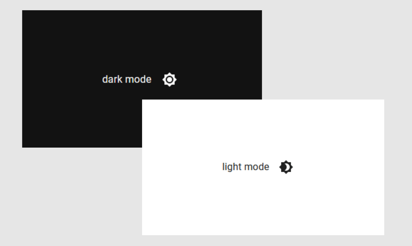
yarn devAll good, guys? The button switches between dark and light modes? Awesome, nice work 👊
If anything is missing, please let me know. I will be happy to help you, developer!
Next Steps
Developers, we learned how to customize colors and to implement the dark/light modes. Next, I recommend you to take a look at the MUI Customization page to learn more about how to customize typography, UI components and more.
If you are new to MUI, take the take to explore the library UI components and learn more about how to use them. With more than 77k stars on GitHub, MUI is one of the most popular UI component libraries in the world 🤩
Useful Resources
Conclusion
Nice work, ladies and gentlemen! You’ve learned enough about MUI to start creating your own themes and making your React app look awesome 👏
I hope you have had a great time with this post, developer! Pass the gained knowledge forward and help others to learn too 😉
In case of any questions or comments, please don’t hesitate to contact me.
Take care, be kind, and see you in the next post!