Hey Developers 🖖 Welcome to the second part of our series about building a Design System!
For those who have just arrived, I highly recommend you to take the time and read the first part. It’s an introduction to what we want to achieve throughout this journey! We wait for you ✌️
No much talking today, we’ve got a lot of work to do together, guys! It’s gonna be fun, I promise 👽
Table of contents
Open Table of contents
Introduction
Following the solution proposed previously, the first action to take place is the creation of a style guide 🎨 No spoilers, but this is the subject of this second part (ha ha) 😀
We’re going to talk about what is a style guide and the things that are usually defined in it. Have I told you the most exciting part? Let’s create one ourselves 🤘
To create our own style guide, we’ll use Figma. It’s a collaborative interface design tool, vector graphics editor, and also prototyping tool. I found it fantastic, and I bet you will find it too!
Again, I’m no professional designer or anything like it. I’ve been having the chance to work with highly skilled designers, so I know my place in this world 😅 However, for the purpose of illustrating our component library journey, I suspect I’m able to be a bit useful in this area!
UI component library is just one part of a Design System. In reality, a design system has the purpose of covering a lot more (brand identity and language, design principles, and more). In this series of posts, we’re focusing only on the journey to build a UI component library. However, and I’m a fan of the subject of design systems, we might cover it a little more in the future
By the way, if you have the interest to learn more about design systems, I recommend the Design Systems with React & Storybook course by Emma Bostian on the Frontend Masters.
Awesome, guys. Now, what exactly is a Style Guide?
Style Guide
A style guide is a set of standards for designing documents, web pages, and anything else that represents a brand. It defines important aspects such as logos, typography, colors, sizes, and more.
The style guide is crucial to improve communication and ensure consistency among all products and applications. Think of it as a form of expression about how a brand feels, looks, and sounds like; its mission and vision, target audience, and personality.
It also supports documentation that informs the dos and dont’s when defining and consuming, the design systems. The better (and well defined) the style guide, the more effective is the branding message!
Shall we define some concepts of a style guide together, using Figma as the tool-of-choice?
Figma
Let’s start our first hands-on exercise of this series of posts! First of all, let’s go to Figma website and sign up, or sign in if you have been there before.
If this is your first experience with the tool, I highly recommend you to spend some time quickly going through the homepage to have a glimpse of the many awesome features!
Creating Project
Once logged in, choose a team name and let’s give our first step! In my case, my team name is UI Component Library Team (feel free to choose whatever suits you better). If you have just signed up, I say to go with the Starter plan as it’s free and enough for what we need in here 👌
Figma gives you the option to start with pre-built templates, from basic ones about different screen sizes, to advanced ones built by the community. Definitely worth exploring it later on, guys. However, for now, a blank canvas sounds like what we need.
Just a quick reminder in case you have missed it, you can download the Figma desktop app to your macOS or Windows 👍
Cool, our team has been created and we have a blank canvas opened? Time to get our hands dirty, developer! In the following sections, the plan is to explore basic concepts of a style guide, such as colors, typography, and a couple of UI components.
Creating Frames
Time to create a frame in the blank canvas. The frame is the start point of everything we create at Figma.
Let’s do it, guys! On the top menu, open the second option and choose Frame:
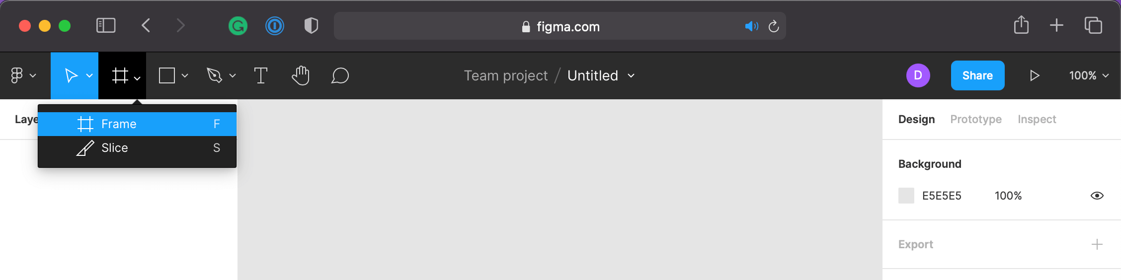
Just draw a square and you’re done! No worry about the size, we can deal with that later on if we have to.
Guys, in my option, key shortcuts are one of the coolest things about Figma! I highly recommend you to check them out:
Nice, now we have a starting point for our style guide. Let’s start creating a few of our brand guidelines!
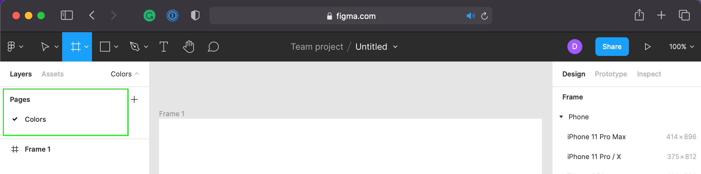
Keeping it Organized
With the purpose of creating a style guide, we need to keep it organized for us to have a better understanding of what we’re doing (as well as to others when they look at our guide).
For so, let’s create pages for our style guide. In my case, I’ve named it according to the next subject, Colors:
Defining Colors
At this stage, we’re going to define what colors represent our brand. Those colors are going to be used in the style guide, and in the components we’re going to create later on. It will vary from the brand colors to the general colors, such as the background color, the text color, and so on.
On the frame we just created, on the Colors page, we’re going to draw a few rectangles to define our colors. We do the first one together, and then you can try it out on your own. Sound good?
On the top menu, open the fourth option and choose Rectangle:
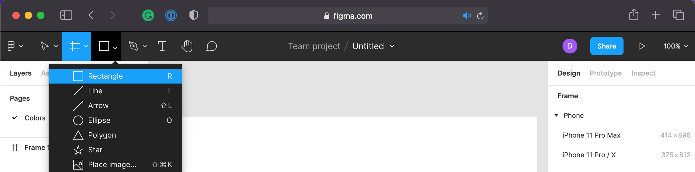
Give a little space on the left, and then draw a rectangle. I suggest using the size similar to the following image, as we have other color rectangles to define later on. Also, let’s add two text labels (the T icon on the top menu) to define the color code and name:
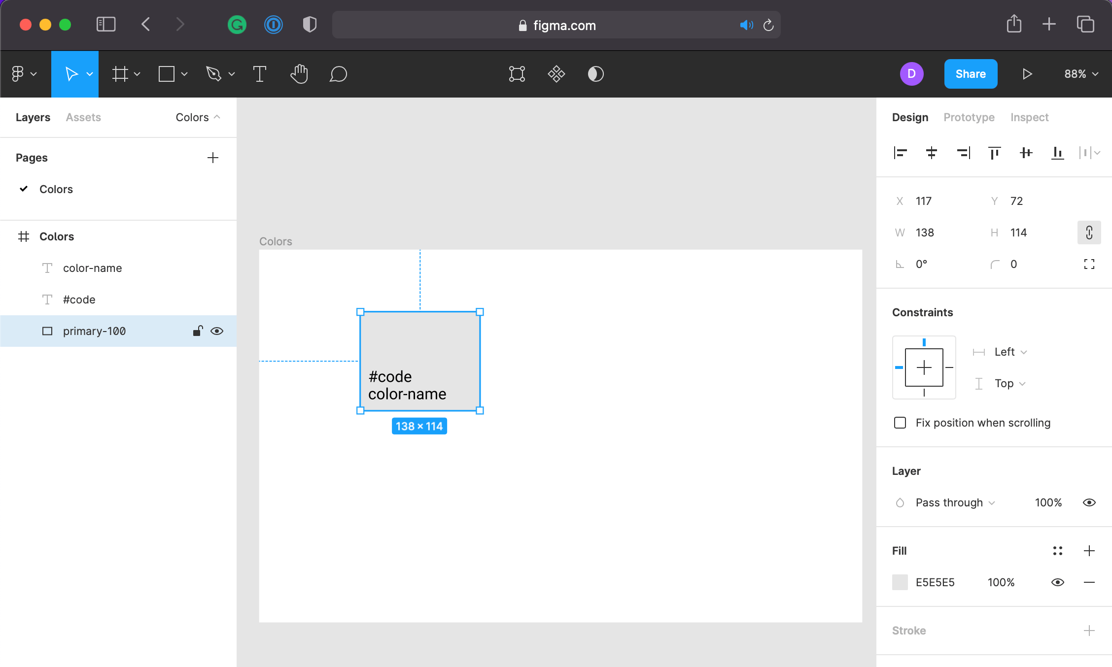
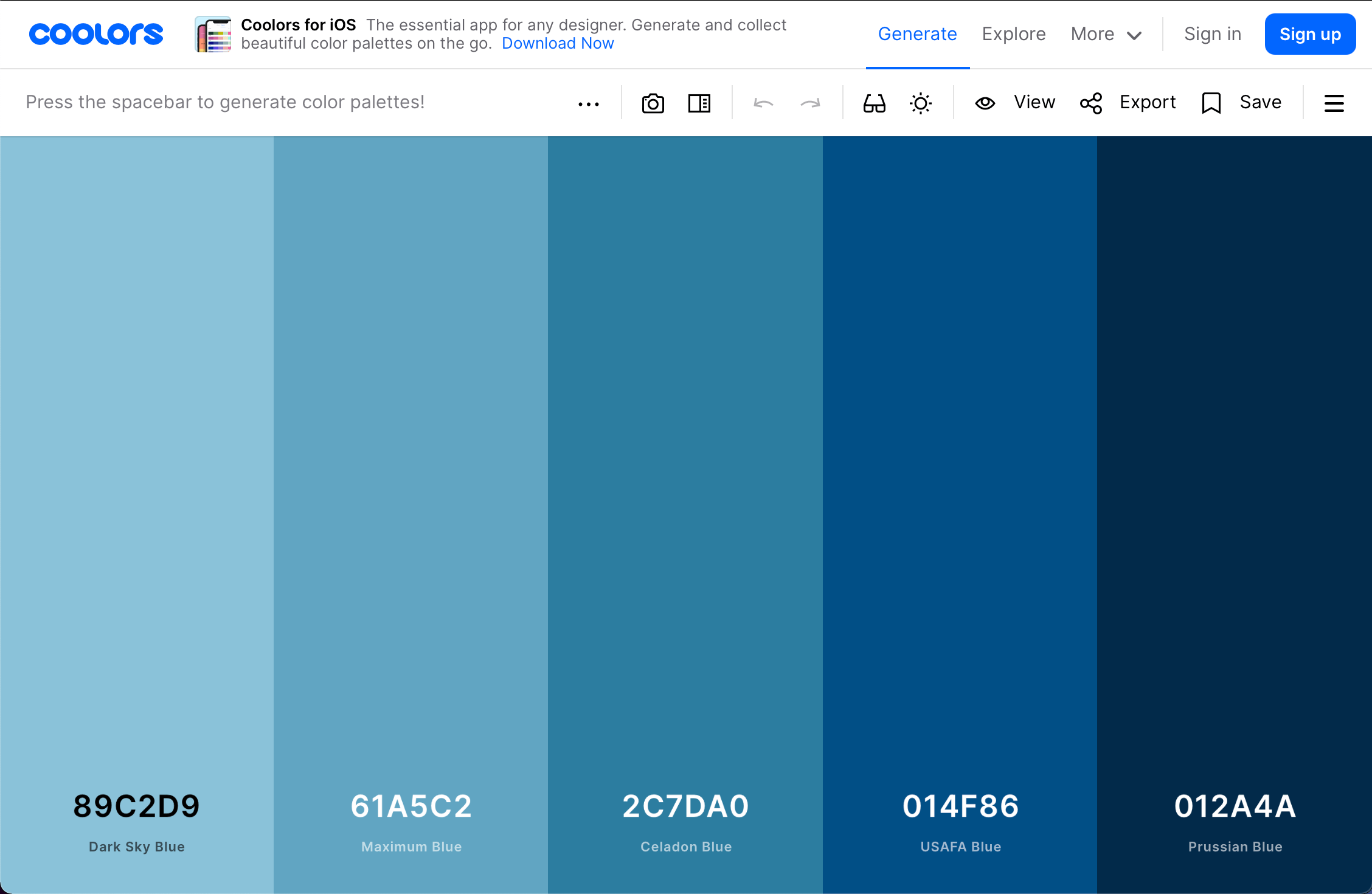
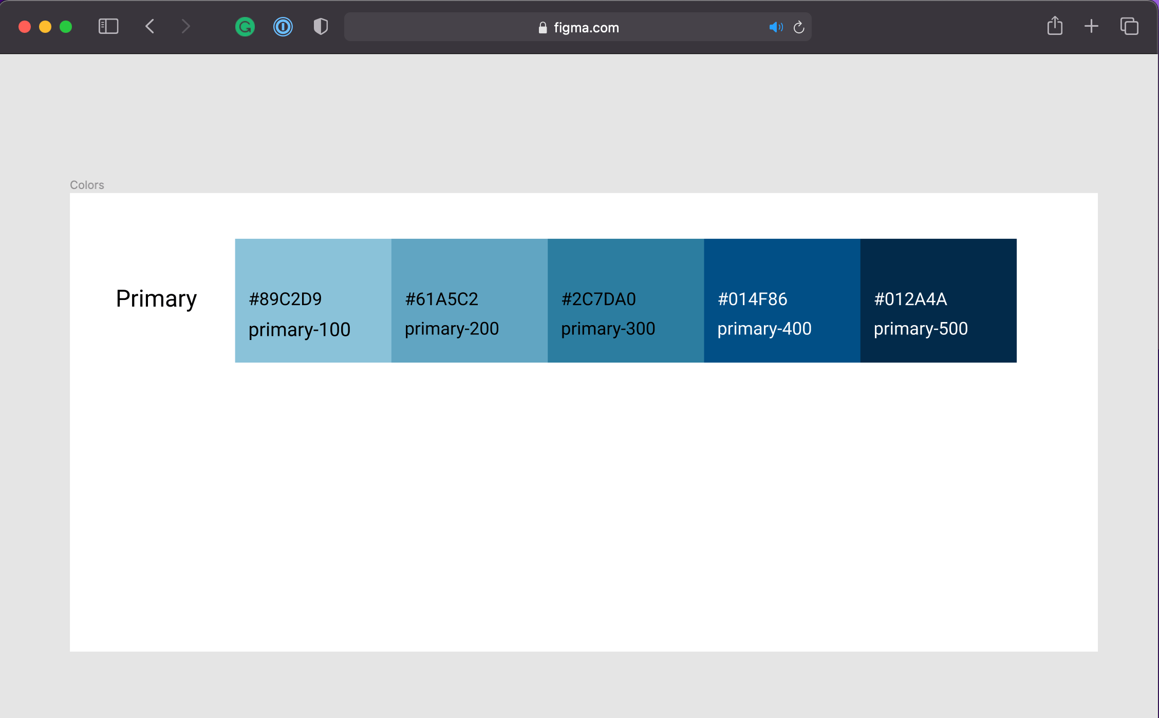
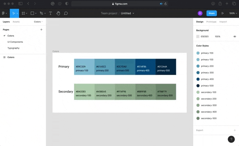
Time to choose a primary color! I quite like to use the Coolors website to get some ideas about color palettes! The exercise now is to choose a color of your choice, and then add it to the canvas. Use the right-side panel to control alignment, color, and more. Just a kind reminder, don’t forget to add the text labels, and set different shades 👌
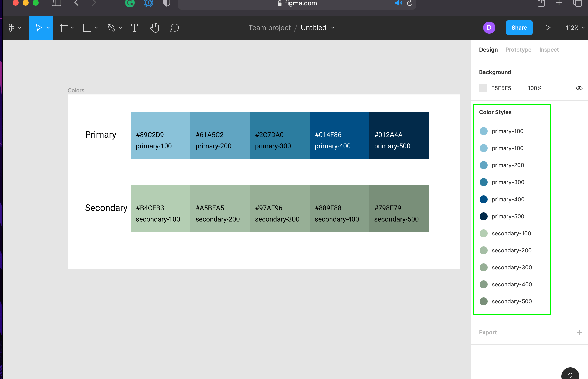
Here’s my choice of colors, guys:
And here’s the result:
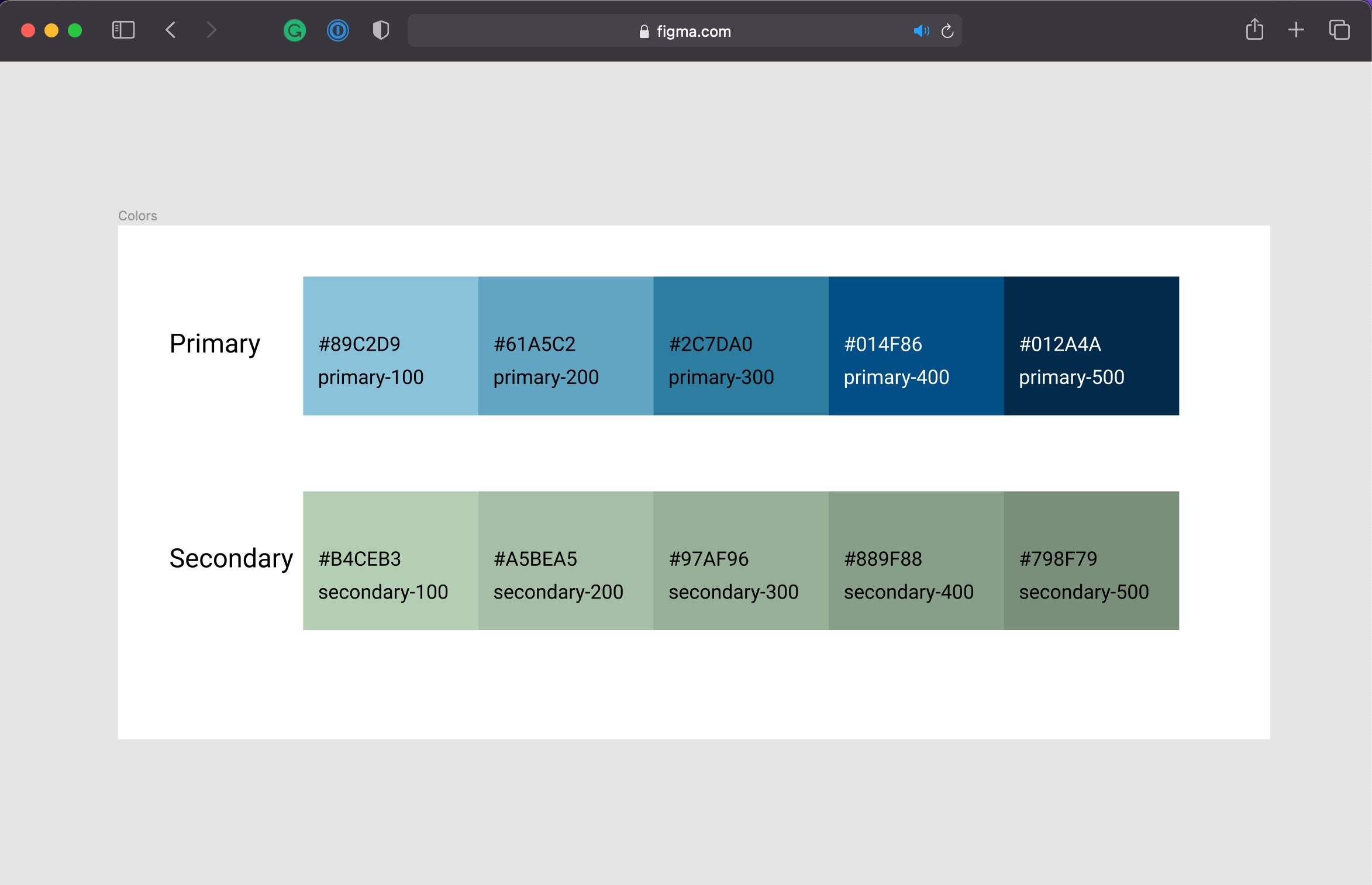
All good on your side, my friends? Great! Now, let’s move on to the next color set, the secondary colors! The exercise will be the same as the previous one, but this time, we’re going to pick a secondary color palette. Ready to go? Go ahead and pick a color!
In case you need some motivation, here are my 2 cents:
Let me show you a cool stuff about defining color style tokens on Figma:
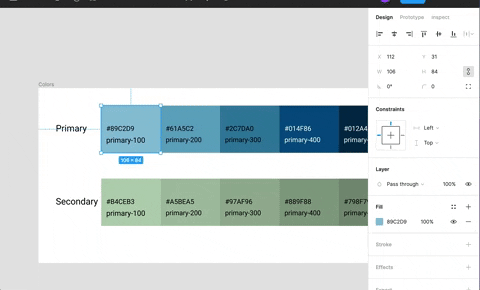
Can you see above how I’m creating a color token? In summary, on the right-side panel, you click on the Style square button next to Fill, then click on Create Style plus button, and finally define the name for the color accordingly.
It’s a simple way to define a color, and it’s a great way to create a consistent color scheme. How about we do the same with the other colors? Believe me, it’ll be worth it later on 👍
Typically, in a real-world, we’re going to have a lot of colors, so it’s a good idea to group them together. For example, we can create status colors, neutral colors, and so on. However, let’s stick to the plan and keep it simple for now ✌️
Fantastic, we’re crashing, guys! Well done! Now, let’s move on to the next subject, Typography.
Defining Typography
New subject deserves a new page in our style guide. Let’s create it!
First, what font do you want to use? I’m going to use Roboto, but you can use whatever font you like.
Next, let’s define the font scale using a handy website called Type Scale. Here’s my setup, guys:
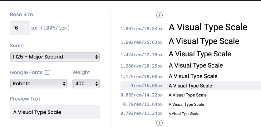
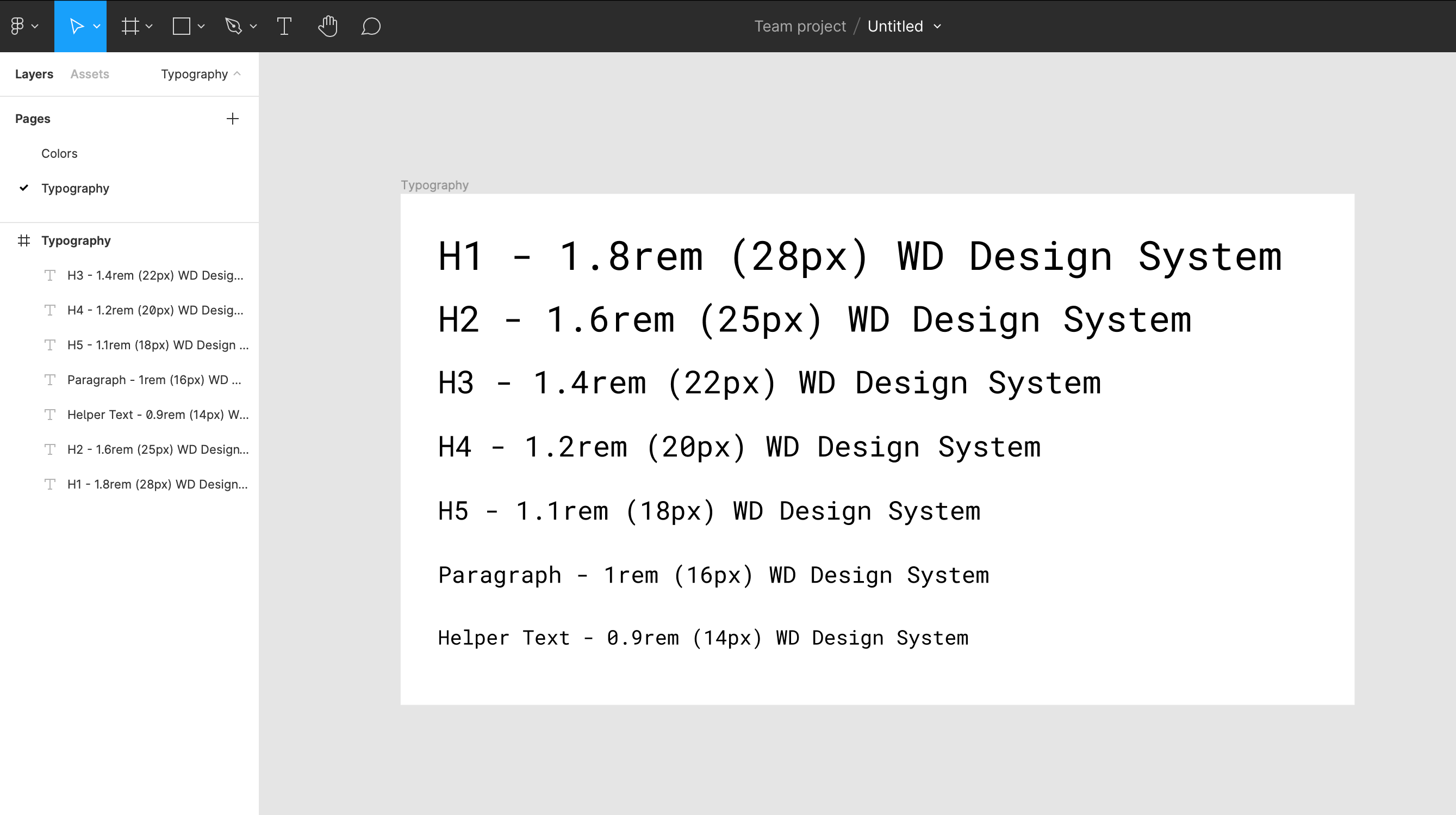
Shall we apply it to our style guide? What we must do is to click on the T menu, and then draw the text area on the canvas. Next, copy & paste one text scale at a time. Last, adjust the text so you define a name for the scale, for example:
H1 - 18rem (28px) WD Design System
The plan is to define a font scale for H1 to H5, Paragraphs, and Helper texts.
Done, guys? Enjoying Figma so far? Here’s what we have so far:
Typography is an important part of a style guide, so it’s a good idea to keep it organized. Now, let’s move on to the next subject, UI Components.
Building UI Components
This is a fun part of the style guide! We’re going to build a bunch of UI components (well, buttons!) 💪
Remember, a new subject is equal to a new page plus new frames. Let’s create it! I’m thinking about having a new page (perhaps called UI Components), and then a new canvas for each component. Sound good to you?
Next, we can start by creating a button. First of all, we must create a new frame for the page. On the top menu, choose Frame:
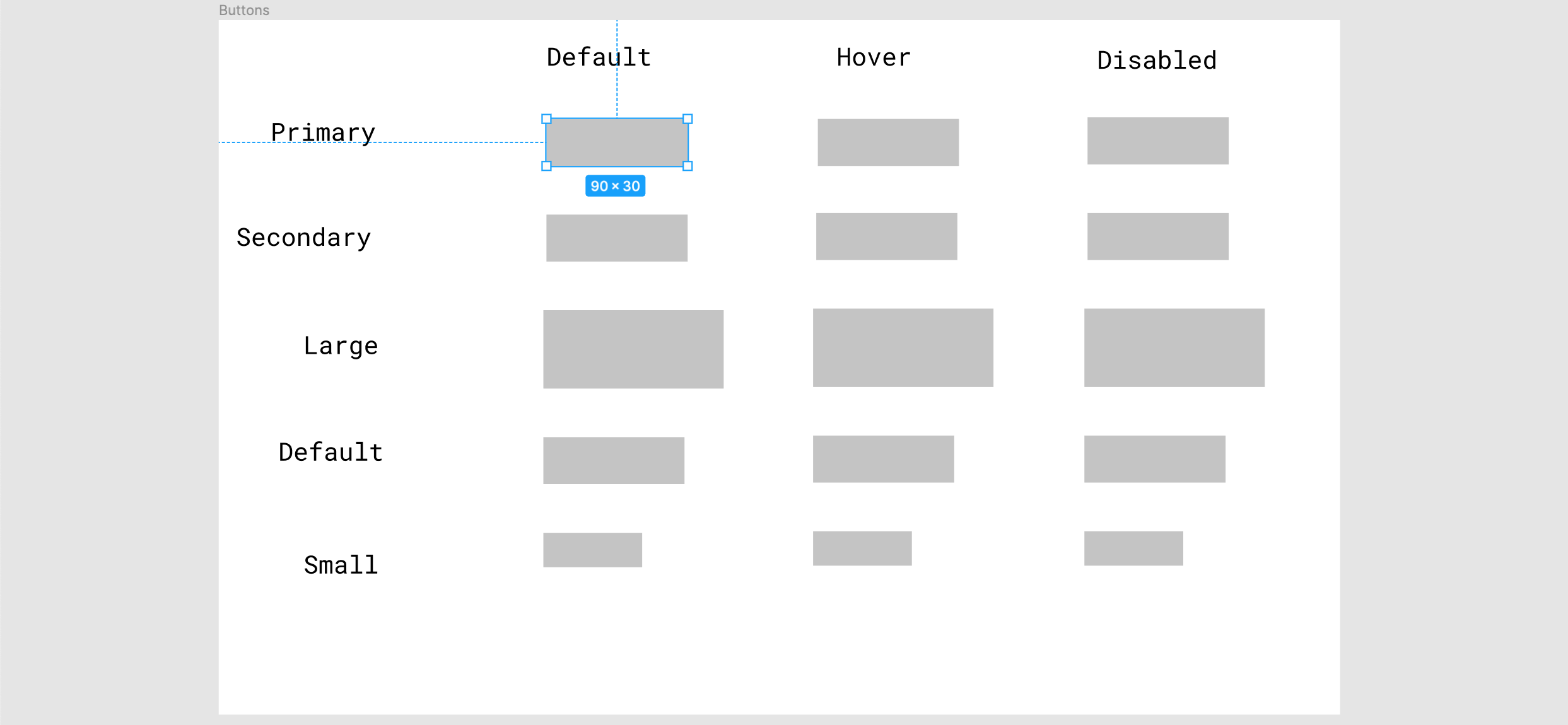
Once you draw the frame, name it as Buttons. To best use space, what do you think we should do? What about the following layout? There are six variations and three states for each button. Hey, remember our goal of today - to keep it simple!
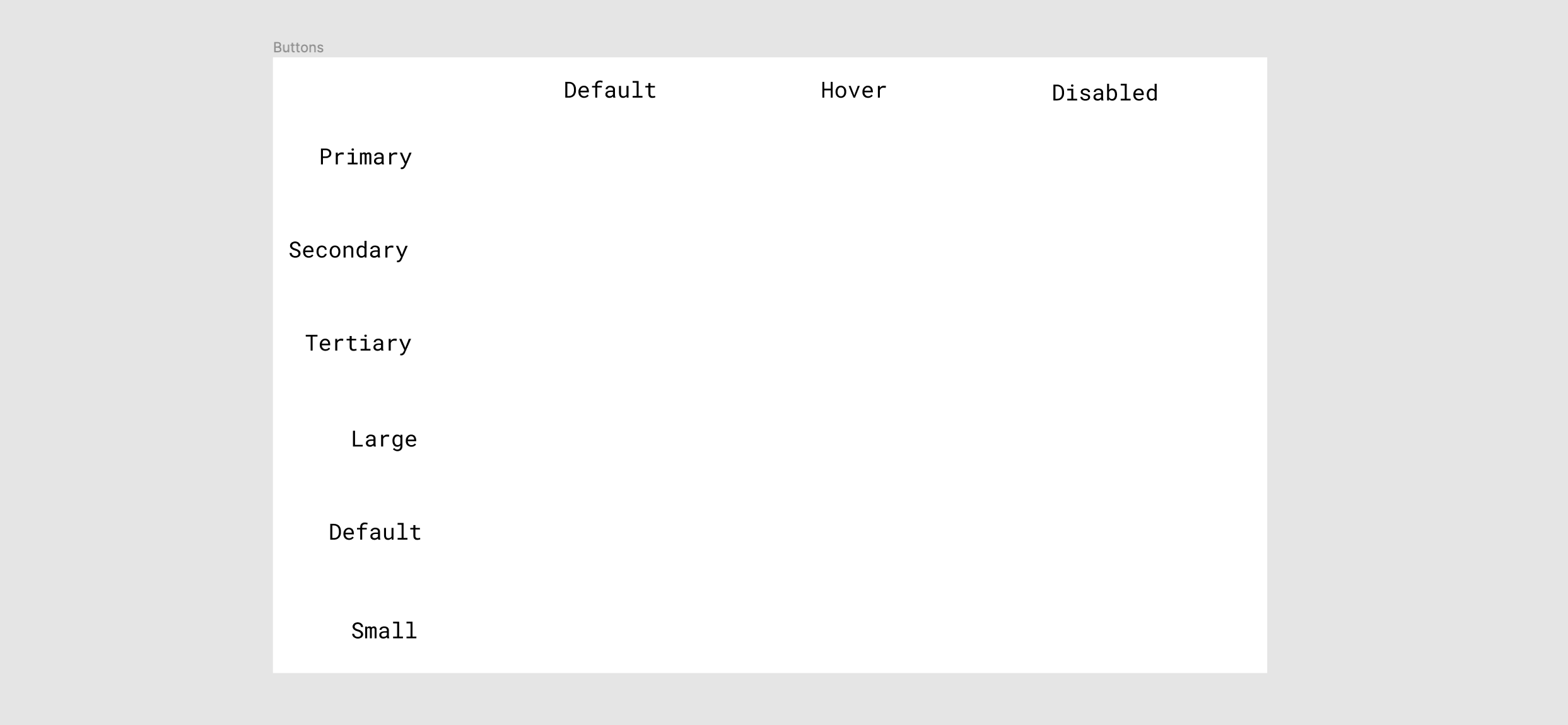
Right, now we’re going to create rectangles to represent buttons. Let’s start by defining the size of the button. I suggest using a size similar to the following image:
May I propose an exercise? Shall we individually define the other buttons using the color style tokens we have created previously, and then compare our solutions later on? Are you with me in this?🧑💻
⚠️ Spoiler Alert! Here is how it is looking like, on my side:
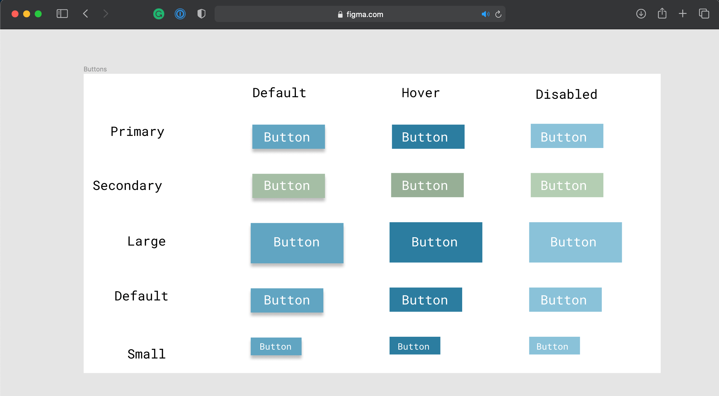
What do you guys think? Looks good enough to go with? A style guide has a lot more UI components than just buttons, but it’s a good start to get familiar with the tool.
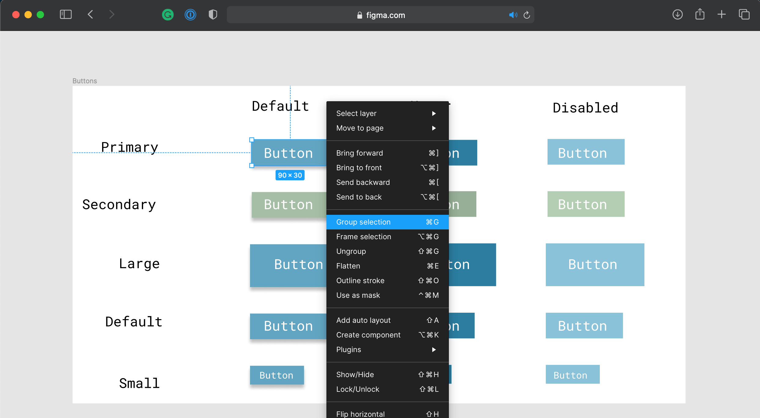
So far so good, developers? Let me say one thing, at this stage, we have only rectangles pretending to be buttons, don’t we? (fake until you make it?! 😒) No need to worry, we’re one click away from creating a UI component:
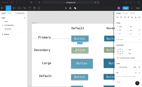
Allow me to give you a piece of advice, before you start creating the components, it’ll be better to group each button and its text as a single object (choose both as press ⌘ + G for Mac, or Ctrl + G for Windows):
Sweet, by converting the rectangles into UI components, we can easily build other components reusing the same style. That’s the concept of component driven development, right? If you are not yet familiar with this concept, I highly recommend you take the time to read this article. It’s an essential concept when developing React apps!
I’d love to write a post about Figma only, exploring things like interactions. Although, I’m going to keep this post specifically short for now. We have a lot to cover in this series of posts, stick with me! 🧙♂️
As you can probably guess, the hard work when building a design system isn’t a one-man show! Time to learn about collaboration on Figma!
Collaboration
There are a few ways for collaboration at Figma. I’d say that collaboration is one of the keywords of the tool.
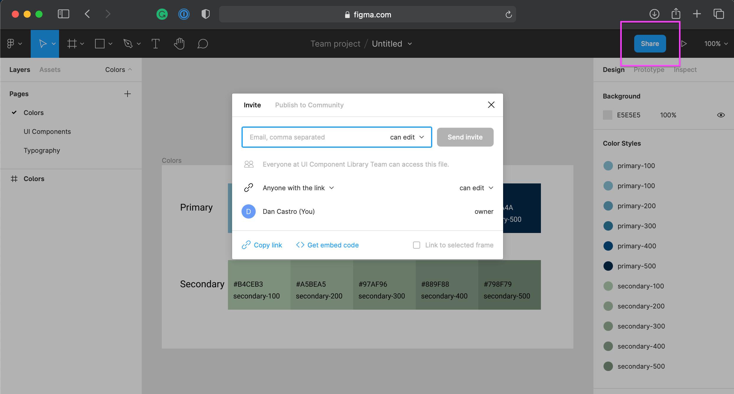
First, you can invite people to become a member of your design team:
Second, you share a link for your style guide with others. It can be a read-only or a read-write link:
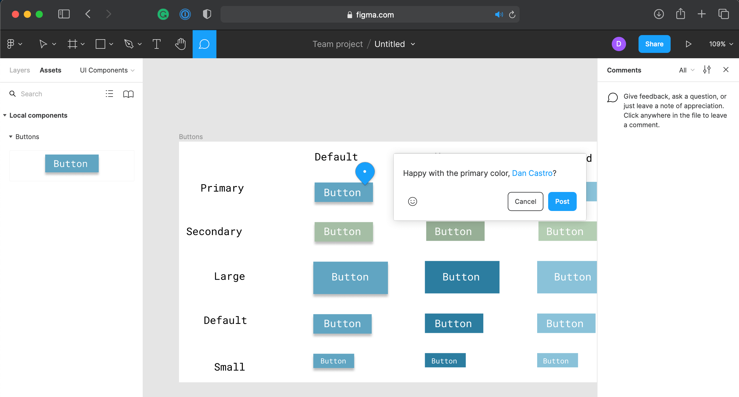
Once you have invited the collaborators you want, you can mention them in the comments of your style guide:
Guys, if you have some spare time, have a look at Figma Jam. It’s an online whiteboard for teams to ideate and brainstorm ideas. It’s a great way to collaborate 👌
Next Steps
That’s all for today, folks! I wish we could dive a lot deeper into Figma, guys. But remember, this is just the first step of our journey (and I’m not a designer ha ha). There are a lot more to learn and see 👊
If you’re interested in learning more about Figma, I highly recommend you to check out the official documentation and the official website. The tool is just incredible!
Here is the agenda for the next part, developers:
- Create a React application so we can start building some UI components.
- Implement and learn about Storybook.
- Explore UI testing with React Testing Library and Jest.
Excited for the next one? So am I, my friends! No worries, it’s gonna be released soon 👊
Conclusion
This tool is really something, huh? Did you guys enjoy working with Figma? It was fun, wasn’t it?
Mission accomplished for today, developers ✅ Thank you so much for sticking around with me!
My sincere congrats on your efforts, guys! I hope you have learned something through this post 👏
See you soon, ladies and gentlemen! Take care and be nice to each other 🤟
Follow Us
The Welcome, Developer has a brand new LinkedIn page! If you enjoy our content, we would be very happy to have you as a follower! In there, we will update you about new posts, new projects, and all the cool stuff!