Hey there, developers! Welcome to the second part of our post on building custom visuals on Power BI using React and D3.js.
And as I always like to say, to those first-timers, be very welcome to our blog 🖖 I invite you to explore our previous posts.
Hope you guys were as much excited as I to have this second and final part released. There are pretty cool stuff coming to you in this post! We’ll talk about creating React components, styling it using awesome CSS libraries, developing events, and much more!
You haven’t read yet the first part of our post? No worries, my friend! You can go
back there now
and learn from the very first steps. No rush, take your time! I’ll be here waiting for you 😉
Now, let me stop with the small talk. So please, grab your coffee and let’s get started, ladies and gentlemen!
Table of contents
Open Table of contents
Environment Setup
This time, we don’t need to worry about certificates or licenses. We can only focus on coding our visuals, which is exactly what we developers love, am I right? ☝️
As the start point, what about we save all the environment setup time we spent on the first part? To me, it sounds far enough! If you don’t have it on your local machine anymore, no problems, feel free to clone it from our GitHub repo.
Awesome, first of all, let’s install the packages we need when talking about React components:
npm i react react-domAnd, as we’re developing a TypeScript app, the React typings are also required:
npm i @types/react @types/react-domGuys, I don’t wanna put the cart before the horse but, as we are installing the packages we will work with, let’s install a pretty cool CSS-in-JS library to style our components:
npm i styled-componentsIf you have checked our post about integrating D3.js with React, you already know what styled-components is about! For those who haven’t yet, I recommend you to have a look at the official page and explore it (the documentation is great!).
Fantastic, developers. We’re good to go now!
Create React Components
It’s time to build a React component and integrate it with our Power BI custom visual. The exciting part in here is to have all the flexibility of React such as state management, JSX, CSS-In-JS, and yet combine it with the self-service approach of Power BI.
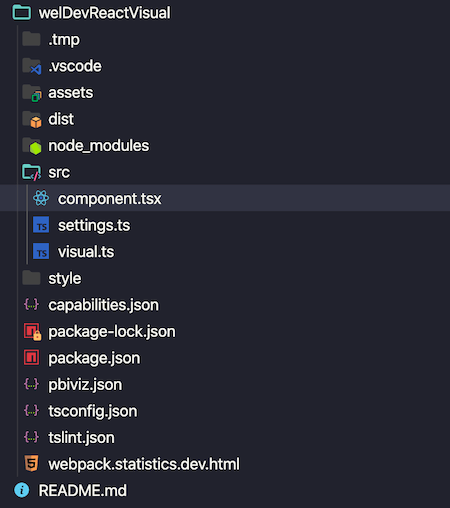
As initial move, please create a new file in the src folder named component.tsx:
Firstly, we want the component to return only a basic text so we can go step-by-step:
import * as React from "react";

export class ReactCard extends React.Component<{}> {
  render() {
    return <div>This is React!</div>;
  }
}

export default ReactCard;
As default, our app is not ready for React TSX files. So let’s apply a tiny change to the tsconfig.json file:
{
    "compilerOptions": {
        "jsx": "react",
        "types": ["react", "react-dom"],
        "allowJs": false,
        "emitDecoratorMetadata": true,
        "experimentalDecorators": true,
        "target": "es6",
        "sourceMap": true,
        "outDir": "./.tmp/build/",
        "moduleResolution": "node",
        "declaration": true,
        "lib": [
            "es2015",
            "dom"
        ]
    },
    "files": [
        "./src/visual.ts"
    ]
}
Before we start enhancing the component, it might be a good idea to import it to our Power BI custom visual and then see it in action!
Remember in part one, when we reset the visual to its most raw state? Good, shall we do it again?
"use strict";
import "@babel/polyfill";
import powerbi from "powerbi-visuals-api";

import DataView = powerbi.DataView;
import VisualConstructorOptions = powerbi.extensibility.visual.VisualConstructorOptions;
import VisualUpdateOptions = powerbi.extensibility.visual.VisualUpdateOptions;
import IVisual = powerbi.extensibility.visual.IVisual;

import "./../style/visual.less";

export class Visual implements IVisual {
  constructor(options: VisualConstructorOptions) {}

  public update(options: VisualUpdateOptions) {}
}
Next, we need to add the reference of our React component. Actually, not only the component’s reference, but also React and React DOM:
"use strict";
import * as React from "react";
import * as ReactDOM from "react-dom";
import "@babel/polyfill";
import powerbi from "powerbi-visuals-api";

import DataView = powerbi.DataView;
import VisualConstructorOptions = powerbi.extensibility.visual.VisualConstructorOptions;
import VisualUpdateOptions = powerbi.extensibility.visual.VisualUpdateOptions;
import IVisual = powerbi.extensibility.visual.IVisual;

import ReactCard from "./component";
import "./../style/visual.less";

export class Visual implements IVisual {
  constructor(options: VisualConstructorOptions) {}

  public update(options: VisualUpdateOptions) {}
}
Personally, I like to keep React’s reference on top of the list and references of local files, at the bottom.
To present any custom visual on Power BI, it’s necessary to set it up in the constructor method:
"use strict";
import * as React from "react";
import * as ReactDOM from "react-dom";

...
import ReactCard from "./component";
...

export class Visual implements IVisual {
 private target: HTMLElement;
 private reactRoot: React.ComponentElement<any, any>;

 constructor(options: VisualConstructorOptions) {
   this.reactRoot = React.createElement(ReactCard, {});
   this.target = options.element;

   ReactDOM.render(this.reactRoot, this.target);
 }
 ...
}
For our friends React developers, you guys know exactly what we’ve just done above. But allow me to explain to everyone. When building a React app, we must render the main component to an element of the DOM, a div let’s say. By doing so, we enable React DOM to manage everything inside this HTML object (div). On row 10, we created an instance of an HTML element so it can render the React component on row 17.
Cool, it’s important to ensure we’re on the right way so let’s start our development server and see the React component in action!
pbiviz startBack to Power BI, please add the developer visual to your report page. Feel free to create a new report or to use the same as the one we previously created (WelcomeDeveloperPtOne):
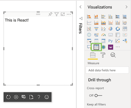
Awesome! Are you thinking the same as myself right now? How limitlessly powerful it can be a React component on a Power BI report? 🔥
I’ve got it, we only have a simple text label printed on the report page so far. No big deal, I know. But guess what, now it’s showtime!
Configure Capabilities
A data visual isn’t useful if it does not present any data. It sounds quite obvious, doesn’t it? Let’s configure our custom visual to perform its role and respond with the data we ask it to.
When we talk about visual roles, automatically we are talking about its capabilities. Please open the capabilities.json file on the root of your application, and double-check if the dataRoles section is as below:
{
  "dataRoles": [
    {
      "displayName": "Measure",
      "name": "measure",
      "kind": "Measure"
    }
  ],
  ...
}
If you have followed the work we did together on the part one, you’re all good. If not, just replace the existing code of the dataRoles section with the code above.
Basically, we’re telling the visual to provide the user with only one input field in the report, a measure.
It’s also essential to set up some rules for it. In our case, we’ll allow only one field to be used as a measure:
{
  ...

  "dataViewMappings": [
    {
      "conditions": [{ "measure": { "max": 1 } }],
      "single": {
        "role": "measure"
      }
    }
  ]
}
At this stage, we are not caring much about the formatting options available that enables the user to customize the visual appearance. Therefore, let’s remove everything from the objects code block:
{
  "dataRoles": [
    {
      "displayName": "Measure",
      "name": "measure",
      "kind": "Measure"
    }
  ],
  "objects": {},
  "dataViewMappings": [
    {
      "conditions": [{ "measure": { "max": 1 } }],
      "single": {
        "role": "measure"
      }
    }
  ]
}
Great, our next lesson is about how to read the measure from the Power BI, and handle it using some of the React features.
Handling Data & State
We’re going to use a great feature from React to show the data through our visual on Power BI, the state management. State can be compared to properties in an object class, regardless of the programming language. For example, in our scenario, we’ll use state to read & write the visual’s label text and measure value. A state in React goes far beyond this simple usage as it’s quite a crucial part of any application, and it can be used in many different approaches.
Now, we adjust the code of the React component to match with the one below:
import * as React from "react";

export interface State {
  textLabel: string;
  measureValue: string;
}

export const initialState: State = {
  textLabel: "",
  measureValue: "",
};

export class ReactCard extends React.Component<{}, State> {
  constructor(props: any) {
    super(props);
    this.state = initialState;
  }

  render() {
    const { textLabel, measureValue } = this.state;

    return (
      <div>
        <p>
          {textLabel}
          <br />
          <em>{measureValue}</em>
        </p>
      </div>
    );
  }
}

export default ReactCard;
Following the highlighted code order:
- We’ve just created an interface to determine the state properties
- Set up the initial value of those properties to string empty
- As we are working with state now, our React component must have a constructor to manage the it
- Read the properties from the state object
- The custom visual must now show the state values, instead of some hard-coded text
We’re almost there, developers. At this point, we are reading data from the state, correct? But what about writing data to the state? Yep, that’s exactly what you’ll learn below.
Hang on, wait! Our React component is not totally ready to refresh once new data is sent to it, is it? 🤔
Just a few tweaks on the code, and we’re good to go to the next stage:
import * as React from "react";

...

export class ReactCard extends React.Component<{}, State> {

  ...

  private static updateCallback: (data: object) => void = null;

  public static update(newState: State) {
    if (typeof ReactCard.updateCallback === "function") {
      ReactCard.updateCallback(newState);
    }
  }

  public state: State = initialState;

  public componentDidMount() {
    ReactCard.updateCallback = (newState: State): void => {
      this.setState(newState);
    };
  }

  public componentWillUnmount() {
    ReactCard.updateCallback = null;
  }

  render() {
    ...
  }
}

export default ReactCard;
Simply by using the methods componentDidMount and componentWillUnmount, we determine what actions the visual should perform when it is loaded into (or removed from) the DOM. In our case, we’re updating the component state values, which automatically also updates the component.
And last but not least, we must also update the visual update method. Just as a reminder, every user action on the Power BI UI is listened by it.
Please go to the src/visual.ts, and update the code with the changes I’ve highlighted next:
"use strict";
import * as React from "react";

...

import { ReactCard, initialState } from "./component";

...

export class Visual implements IVisual {

  ...

  public update(options: VisualUpdateOptions) {
    if (options.dataViews && options.dataViews[0]) {
      const dataView: DataView = options.dataViews[0];

      ReactCard.update({
        textLabel: dataView.metadata.columns[0].displayName,
        measureValue: dataView.single.value.toString()
      });
    } else {
      ReactCard.update(initialState);
    }
  }
}
The goal here is to update the React component, passing to it the values coming from the Power BI. In part one, I’ve presented how to understand the structure of the visual data view. If you need a refresher, just go back there and have a quick read, no need to rush.
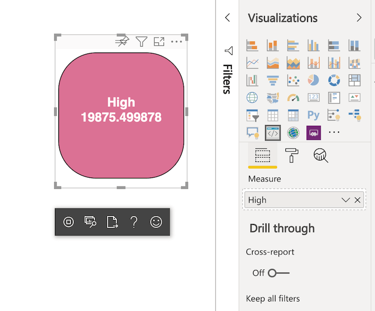
If a value is returned from the report, it’s sent to the React component through the textLabel and measureValue state properties. Otherwise, the initial state is set to it.
Time to check if our custom visual is working as we expect. With the development server up and running, back to Power BI:
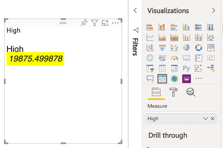
Okay, it’s showing correctly the label text and the measure value. But on the other hand, let’s agree it’s looking terrible. No worries, help is on the way! This is a job for Styled-components 👍
Component Style
Because styled-components is based on the concept of CSS-in-JS, the React component is the right place to build its style:
import * as React from "react";
import styled from "styled-components";
const StyledCard = styled.div`
position: relative;
box-sizing: border-box;
border: 1px solid #000;
border-radius: 50%;
width: 200px;
height: 200px;
`
const StyledLabel = styled.p`
text-align: center;
line-height: 30px;
font-size: 20px;
font-weight: bold;
position: relative;
top: -30px;
margin: 50% 0 0 0;
`
...
export class ReactCard extends React.Component<{}, State>{
...
render(){
const { textLabel, measureValue } = this.state;
return (
<StyledCard>
<StyledLabel>
{textLabel}
<br/>
<em>{measureValue}</em>
</StyledLabel>
</StyledCard>
)
}
}
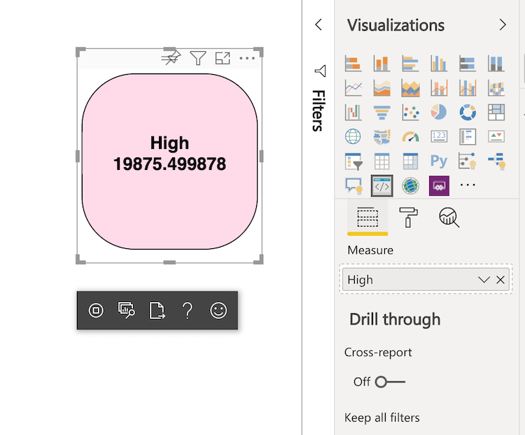
export default ReactCard;Note on the top of our code, we imported the styled-component package. Secondly, we created two styled components, StyledCard and StyledLabel. See how amazing we can customize existing elements’ style, such as div and paragraph, and then use it as completely new components (rows 33 and 34).
Let’s check how our custom visual is looking now on the report:
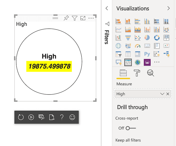
Quite better, isn’t it? Great, we’ve created almost a professional Power BI visual. Why almost, what is it missing, then? It must be resizable and responsive!
As the term already suggests, to make our custom visual responsive it must respond to a certain action. In this case, the action is when the user resizes the visual. We want it to adapts to the new size, transforming labels and values’ properties accordingly.
If we’re talking about reading user actions, then the src/visual.ts file is our place!
"use strict";
import * as React from "react";

...

import IViewport = powerbi.IViewport;

...

export class Visual implements IVisual {
  private target: HTMLElement;
  private reactRoot: React.ComponentElement<any, any>;
  private viewport: IViewport;

  ...

  public update(options: VisualUpdateOptions) {
    if (options.dataViews && options.dataViews[0]) {
      const dataView: DataView = options.dataViews[0];

      this.viewport = options.viewport;
      const { width, height } = this.viewport;
      const size = Math.min(width, height);

      ReactCard.update({
        size,
        textLabel: dataView.metadata.columns[0].displayName,
        measureValue: dataView.single.value.toString()
      });
    } else {
      ReactCard.update(initialState);
    }
  }
}
The IViewPort interface enables us to read the visual properties from Power BI. In this case, we’re interested in width and height values (row 20). The calculated size value is then sent to the React component through its size state property, which hasn’t been yet created. So, let’s go back to the React component:
import * as React from "react";
import styled from "styled-components";

const StyledCard = styled.div`
  position: relative;
  box-sizing: border-box;
  border: 1px solid #000;
  border-radius: 50%;
  min-width: 200px;
  min-height: 200px;
`;

...

export interface State {
  textLabel: string;
  measureValue: string;
  size: number;
}

export const initialState: State = {
  textLabel: "",
  measureValue: "",
  size: 200
};

export class ReactCard extends React.Component<{}, State> {

  ...

  render() {
    const { textLabel, measureValue, size } = this.state;
    const style: React.CSSProperties = { width: size, height: size };

    return (
      <StyledCard style={style}>
        <StyledLabel>
          {textLabel}
          <br />
          <em>{measureValue}</em>
        </StyledLabel>
      </StyledCard>
    );
  }
}

export default ReactCard;
Let’s understand the changes on our code. As we are enabling the user to resize the visual, it’s important to set a minimal size so the data can always be presented properly (rows 9, 10). Next, we created a new size property in the state so the styled card can be adjusted accordingly.
Awesome, we officially have a responsive custom visual. Feel free to go to your report and give it a try! Well done, everyone 👏
Every property of the React component is managed through its state, when integrating it with a Power BI custom visual. If we want to control any other property, such as color or border, a new property must be added to the component state and passed by the visual class (src/visual.ts).
I’m so keen on covering more examples handling different properties, however, I’m afraid this post would be a little tiring for some of you to follow. So, I want to use this opportunity and leave here an exercise to you! Sound good? Back to first part again, we added some format options to the visual so the user could change the background colour and border thickness. Would you be up to extend your React component and add this feature? Hope it gives you some fun times!
Component Events
This is a little and quick bonus to you for making to this point of our post!
How fantastic it would be to add some events to our reporting card, such as mouse hover, for example? It sounds quite cool, right?
Let’s open the src/component.tsx to change the configure the event, and replate the styled components by the following:
...

const StyledCard = styled.div`
  position: relative;
  box-sizing: border-box;
  border: 1px solid #000;
  border-radius: 30%;
  min-width: 100px;
  min-height: 100px;
  background: palevioletred;
  transition: fill 0.5s;
  &:hover {
    background: #FFDBE9;
  }
`;

const StyledLabel = styled.p`
  text-align: center;
  font-size: 18px;
  font-weight: bold;
  color: #FFFAFA;
  position: relative;
  top: -30px;
  margin: 50% 0 0 0;
  transition: fill 0.5s;
  ${StyledCard}:hover & {
    background: #FFDBE9;
    color: black;
  }
`;
...
I’ve decided to tweak the visual style a bit, but most important, please note the hover event on both components. It’s just a basic CSS mouse event, but it becomes cooler when applied to a Power BI visual!
Once you have applied the new code, have a look at it on Power BI. It should look as following:
Now, when hovering the mouse over it, the background and font colour changes:
It’s just a simple case of setting an event to a custom visual, go ahead and use your creativity!
Packaging Custom Visual
Time to share our work with coworkers and friends, guys! It’s a simple task, I’ll guide you throught it.
It’s important to review the settings before publish the Power BI custom visual. Let’s go to the pbiviz.json file:
{
  "visual": {
    "name": "welDevReactVisual",
    "displayName": "Awesome React Visual",
    "guid": "welDevReactVisual1A4B9C17E6914119B3E74B5F3EC46009",
    "visualClassName": "Visual",
    "version": "1.0.0",
    "description": "Built on Welcome, developer!",
    "supportUrl": "https://www.welcomedeveloper.com/",
    "gitHubUrl": "https://github.com/danilocastronz/weldev-post-powerbi-react-d3-two"
  },
  "apiVersion": "2.6.0",
  "author": { "name": "DanCastro", "email": "Dancastro@welcomedeveloper.com" },
  "assets": { "icon": "assets/icon.png" },
  "externalJS": null,
  "style": "style/visual.less",
  "capabilities": "capabilities.json",
  "dependencies": null,
  "stringResources": []
}
A few options for you to customize. You’re welcome to set it as you like. Also, you can choose a cool icon to your visual and then replace the existing one from the assets/icon.png.
Next step, run the command below on the terminal to generate the visual package:
pbiviz packageFantastic. Check the dist folder in your application, you should be able to find a file of extension .pbiviz. This is the file we use to import to Power BI our new custom card.
Go to Power BI, and click on the ellipsis to import a visual from a file:
Choose the .pbiviz file from the dist app folder, and that’s it guys!
If you want to share your new custom visual with others, the .pbiviz file is what you need.
Useful Resources
Conclusion
Thanks a lot all of you. I really appreciated your attention!
The app we built together is available on our GitHub repo for you to clone and enhancing it as you want.
For those who have got to the end of this second and last part of our post, I can only say your effort and hard-working is nothing but very admirable 👏 I have no doubts how far you will go!
Hope this post has helped you with your learning journey, your project, or even by just opening your mind to new fields and possibilities.
Stay tuned, and see you next week with a new exciting post, developers!
Follow Us
The Welcome, Developer has a brand new LinkedIn page! If you enjoy our content, we would be very happy to have you as a follower! In there, we will update you about new posts, new projects, and all the cool stuff!