It’s good to have you back, developer! And for the first-timers, be very welcome to our blog 🖖
Before we start talking about technology today, in times of coronavirus, I send my ♡ to all of you around the world. I hope you are all safe at your homes and looking after each other. In times like this, kindness and empathy are the most admirable feelings people can share. Better days are coming, so be strong and never lose hope!
Here we go with another exciting subject to talk about today. What about using web frameworks to build Business Intelligence (BI) reporting visuals? It does sound interesting, doesn’t it?
And what if I tell you that we just need to add one more variable to our lastest post’s tutorial? Yep, that’s true; and this variable is called Microsoft Power BI 🤘
In today’s post, we will build together a Power BI custom visual using React and D3.js. Pretty cool, huh?
I can even imagine, you’re probably now wondering how limiteless it can be to combine the powerful of D3.js SVG charts with the self-service approach of Power BI. And you’re totally right 🔥
My point on this new post is to show you how we can create cool Power BI custom visuals, and not essentially how to use Power BI. Although, I really care about all of you be able to follow the examples. So for those with some experience with the reporting tool, I apologize for the basic steps we’ll cover. The idea is only to not exclude anyone ♡
With the only purpose of providing you with an enjoyable reading and a post that is easy to follow, and effective to get the most of it, I’ve decided to split the subject into two parts.
In the first part, we talk about environment setup, creating a Power BI dataset and report, developing a basic custom visual using D3.js, and how to debug it. In the second part, we cover building a more advanced visual to present financial data, but this time combining it with React components. How does it sound?
I hope you enjoy! Grab your source of caffeine, open your favourite code editor, and let’s dive into it!
To start building our first reporting visual, first we must check a few boxes I have to assume. But hey, let’s keep up the momentum. The harder the battle the sweeter the victory!
Table of contents
Open Table of contents
- Sign Up Power BI Pro License
- Development Setup
- Installing OS Certificate
<Windows/><OSX/>- Creating a Power BI visual
- Importing Data
- Creating Report
- Custom Visual Online
- Enhancing with D3.js
- App Main Components
- Building a D3 visual
- Adding Format Options
- Useful Resources
- Update ⚡
- Conclusion
- Follow Us
Sign Up Power BI Pro License
To visualize and test the visual we’re developing together, you need a Power BI license to start. It’s free and easy to sign up for a trial on the Pro version, just go to the official page and follow the instructions when clicking on Try free. Once the trial period has expired, there is no charge at all and you are just assigned back to a basic free license.
Power BI is a fantastic self-service reporting tool, I’m sure you will have plenty of stuff to explore during your trial period. Give it a go and have fun, developer!
Development Setup
The first requirement of our list is to have Node.js installed on our machine. If you have followed our previous post, you can skip this step; otherwise, just download and install it. Once it’s done, please restart your computer and let’s go to the next step!
Now, we must install the PowerBI Visual Tools (pbiviz) package. It gives us the ability to build custom visuals:
npm i -g powerbi-visuals-toolsBy the way, do you want to learn some handy NPM CLI commands? Check it out the NPM CLI official documentation.
By quickly running the pbiviz command on your terminal (or Windows PowerShell), you should get this cool output:
Brilliant, a first movement towards our goal. Now, our computers are ready to create our first custom visual app using React and D3.js!
Oh wait…not quite yet. First, a certificate must be created and installed.
Installing OS Certificate
Depending on which OS you are a fan, how we create and install a certificate can varies a bit. Do not worry, Windows and OSX’s users, I’ve got you all covered guys 👌
< Windows />
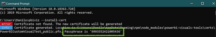
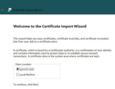
To create a certificate on Windows, let’s run the following code:
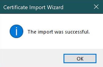
pbiviz --install-certThe result of the command above should guide us into the next phase by providing a passphrase and opening the Certificate Import Wizard:
In the next step, enter your passphrase:
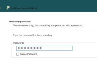
That’s it. All done!
< OSX />
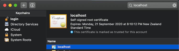
Based on the setup that we need to go through, creating a certificate on OSX is quite simplier than on Windows. You will see what I mean by looking at the steps below.
First, we must access the Keychain Access to manage the machine certificates and search for localhost:
All you’ve to do now is to double-click on the certificate and set all options to Always Trust:
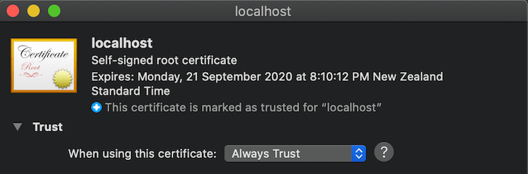
Piece of cake, right? Just remember to close any browser you have opened, so we don’t waste time troubleshooting cache issues (guilty!).
Creating a Power BI visual
Enough of configurations, don’t you think? Where is the cool stuff, huh? Guess what, It starts right now 👽
All the code below have been developed using a OSX computer, however, it is exactly the same regardless your OS.
Before we start creating React components, let’s create a basic Power BI custom visual, called WelDevReactVisual:
pbiviz new WelDevReactVisual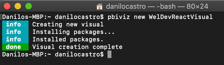
It provides us with a boilerplate code so we can save some development time. It’s well worth it. It creates an app with TypeScript (which is a superset of JavaScript), Less, and D3.js already imported.
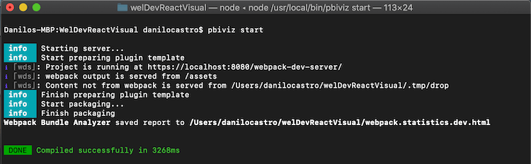
For the next step, let’s quickly open the new application using our favorite code editor (I personally like to use the VS Code) and run the pbiviz start command to start our development server:
cd WelDevReactVisual
code .
pbiviz start
Good, the code above should produce the following output:
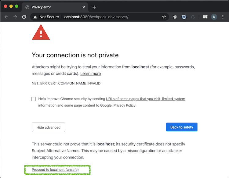
Fantastic, we’re on the right path! Now if everything went as it was supposed to, we should be able to access localhost:8080/webpack-dev-server.
If you are presented with some kind of security warning message on your browser, just allow the access and proceed:
Time to see our new custom visual in action on Power BI. I’m sure this will keep you excited on keeping going with me!
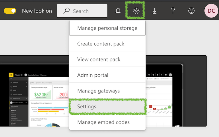
Jump into PowerBI.com, and sign in using your credentials.
Once you’re in, go to Settings:
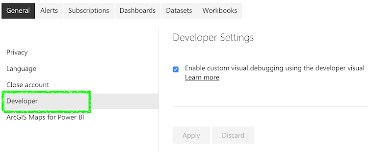
On the Developer section, check the option that enables custom visual debugging:
Almost there! Let’s import some data and create a new Power BI report to test our visual.
Importing Data
On the root of the GitHub repository of this post, I’ve created a CSV file named GC=F.csv that contains historical financial data from Yahoo Finance. Feel free to download it to your local machine.
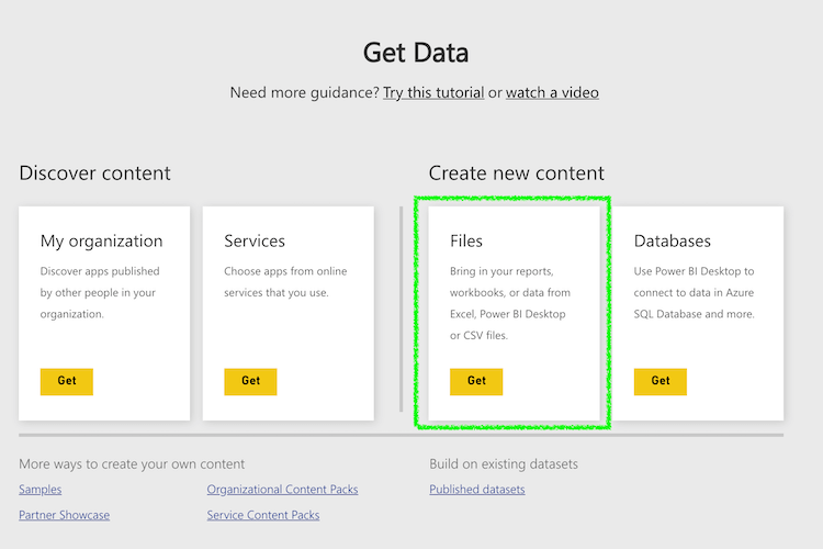
Next, we’re gonna import the file and create a new dataset on Power BI. On your workspace, go to Get Data and select the Files option:
Great, we have some real-world data to play with. Our financial dataset is available on your workpace.
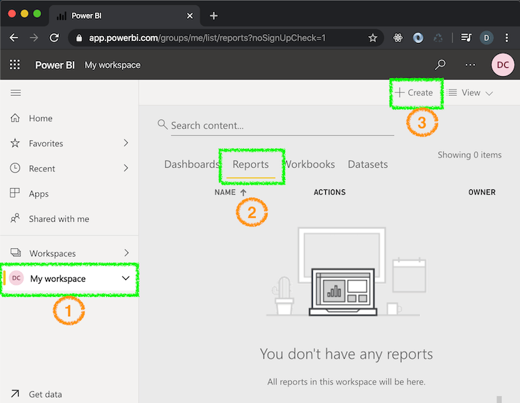
Creating Report
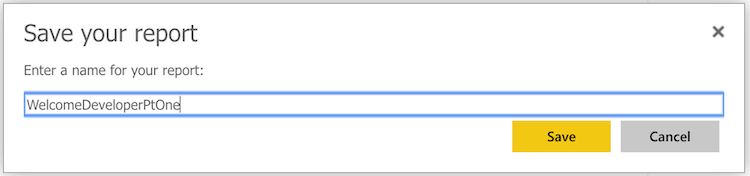
Now that we have some data to consume, we can create a Power BI report linked to our financial dataset. We only need to follow the ordered steps below, choose the GC=F dataset, and we should be all good. For this exercise, the report name is WelcomeDeveloperPtOne:
Custom Visual Online
First step to see our custom visual in action is to start your local development server, in case it hasn’t already, by running the code:
pbiviz startGo to the Power BI report we previously created, and add the Developer Visual visual to it:
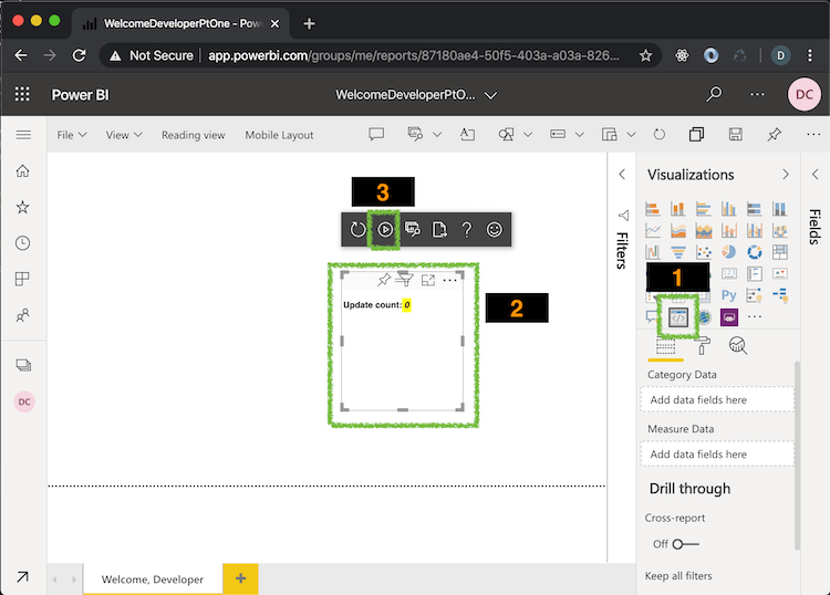
Quick summary on the image above:
1: Developer Visual, required to debug a custom visual
2: Basic custom visual, showing the number of updates applied to it
3: It’s handy to enable the Auto Reload option so we can automatically see the changes reflected on the visual
When we add a developer visual to a report, it works as a listenner to your local host. So any change we applied to the WelDevReactVisual app, is reflected on the Power BI report. It makes our life easier when testing it. Now, drag any field from the dataset table onto our custom visual to observe an increment happening on the visual’s label.
Excellent, you have just created your first Power BI custom visual. Well done, mate!
Time to go back to our app to explore the code, and start to building something useful from it.
Enhancing with D3.js
I’ve got to be honest, I love this part of the post. I’m always facinated how D3 gives us the ability to acchive almost any requirement when designing and developing data visuals. It’s absolutelly interesting to integrate it with self-service reporting on Power BI!
Our goal is this first part of the post is to introduce the main concepts, so we will create just a simple D3 visual.
On WelDevReactVisual app, expand the node_modules folder to check the packages d3, @type/d3, core-js, and powerbi-visuals-api are installed. If you can’t find any of these, just run the npm install for all the missing packages:
npm istall d3 @types/d3 core-js powerbi-visuals-apiWe’ve got all we need now to start developing our first visual using D3.js.
App Main Components
Among the many components of the visual application, I want to get your attention to four of them:
- src/visual.ts
I’d say this is the main component. It’s responsible for the visual design and update logic.
- src/settings.ts
This is responsible for reading the visual format settings.
- style/visual.less
As the name indicates, it’s responsible for setting the visual style.
- capabilities.json
In this one, we set the options available to the user when using the visual on Power BI, such as fields and format options.
Now that we know the purpose of the main components, we can remove the code we won’t need and start developing ours.
Building a D3 visual
Replace the existing code on src/visual.ts with the one below. We are simply reseting the visual to its raw form:
"use strict";

import "core-js/stable";
import ".../../assets/react-d3js-powerbi-part-one/style/visual.less";
import powerbi from "powerbi-visuals-api";
import IVisual = powerbi.extensibility.IVisual;
import VisualConstructorOptions = powerbi.extensibility.visual.VisualConstructorOptions;
import VisualUpdateOptions = powerbi.extensibility.visual.VisualUpdateOptions;
import EnumerateVisualObjectInstancesOptions = powerbi.EnumerateVisualObjectInstancesOptions;
import VisualObjectInstanceEnumeration = powerbi.VisualObjectInstanceEnumeration;
import IVisualHost = powerbi.extensibility.visual.IVisualHost;

import * as d3 from "d3";
type Selection<T extends d3.BaseType> = d3.Selection<T, any, any, any>;

export class Visual implements IVisual {
  constructor(options: VisualConstructorOptions) {}

  public update(options: VisualUpdateOptions) {}
}
Next, we must develop the code to build a D3 component:
"use strict";
import "core-js/stable";
import ".../../assets/react-d3js-powerbi-part-one/style/visual.less";
import powerbi from "powerbi-visuals-api";
import IVisual = powerbi.extensibility.IVisual;
import VisualConstructorOptions = powerbi.extensibility.visual.VisualConstructorOptions;
import VisualUpdateOptions = powerbi.extensibility.visual.VisualUpdateOptions;
import EnumerateVisualObjectInstancesOptions = powerbi.EnumerateVisualObjectInstancesOptions;
import VisualObjectInstanceEnumeration = powerbi.VisualObjectInstanceEnumeration;
import IVisualHost = powerbi.extensibility.visual.IVisualHost;
import * as d3 from "d3";
type Selection<T extends d3.BaseType> = d3.Selection<T, any, any, any>;
export class Visual implements IVisual {
private host: IVisualHost;
private svg: Selection<SVGElement>;
private container: Selection<SVGElement>;
private circle: Selection<SVGElement>;
private textValue: Selection<SVGElement>;
private textLabel: Selection<SVGElement>;
constructor(options: VisualConstructorOptions) {
this.svg = d3
.select(options.element)
.append("svg")
.classed("circleCard", true);
this.container = this.svg.append("g").classed("container", true);
this.circle = this.container.append("circle").classed("circle", true);
this.textValue = this.container.append("text").classed("textValue", true);
this.textLabel = this.container.append("text").classed("textLabel", true);
}
public update(options: VisualUpdateOptions) {}
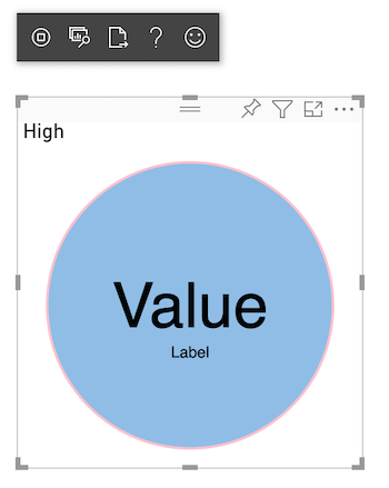
}Please note the code I highlighted above. The idea is to show you how easy we can build a basic D3 SVG component. On row number 30, we append a circle to the SVG component to present the custom visual’s data.
Our next step is to develop the update method, which tells the visual how it should behaviour when it gets updated on Power BI:
  ...

    public update(options: VisualUpdateOptions) {
      let width: number = options.viewport.width;
      let height: number = options.viewport.height;
      this.svg.attr("width", width);
      this.svg.attr("height", height);
      let radius: number = Math.min(width, height) / 2.2;
      this.circle
          .style("fill", "#007acc")
          .style("fill-opacity", 0.5)
          .style("stroke", "pink")
          .style("stroke-width", 2)
          .attr("r", radius)
          .attr("cx", width / 2)
          .attr("cy", height / 2);
      let fontSizeValue: number = Math.min(width, height) / 5;
      this.textValue
          .text("Value")
          .attr("x", "50%")
          .attr("y", "50%")
          .attr("dy", "0.35em")
          .attr("text-anchor", "middle")
          .style("font-size", fontSizeValue + "px");
      let fontSizeLabel: number = fontSizeValue / 4;
      this.textLabel
          .text("Label")
          .attr("x", "50%")
          .attr("y", height / 2)
          .attr("dy", fontSizeValue / 1.2)
          .attr("text-anchor", "middle")
          .style("font-size", fontSizeLabel + "px");
    }
}
At this stage, the new visual is ready to be tested. Now, remember how we debug a custom visual? Ensure the development server is up and running, and open the report on Power BI:
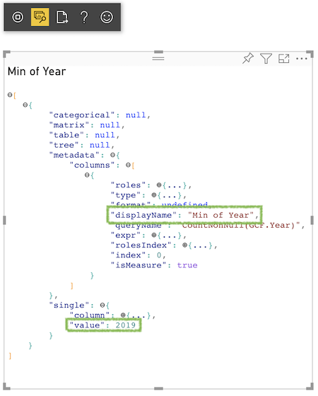
As you can see, on the rows 19 and 27 of our update method code, the measure value and the label text is hard-coded. To fix it, we must do a few changes to our TypeScript application:
"use strict";

...

import DataView = powerbi.DataView;

export class Visual implements IVisual {

  ...

  constructor(options: VisualConstructorOptions) {
    ...
  }

  public update(options: VisualUpdateOptions) {
    let dataView: DataView = options.dataViews[0];
    let width: number = options.viewport.width;
    let height: number = options.viewport.height;
    this.svg.attr("width", width);
    this.svg.attr("height", height);
    ...
    this.textValue
      .text(<string>dataView.single.value)
      ...
    this.textLabel
      .text(dataView.metadata.columns[0].displayName)
      ...
  }
Please check the highlighted code above, we are now reading the values from the visual data view. You might be wondering how I ended up finding the values into the data view object, am I right? To understand the structure of it, I’ve explored the Show Dataview option from the visual:
Almost there, developer. Update the sections dataRoles and dataViewMappings of your capabilities.json file, with the highlighted following code:
{
    "dataRoles": [
        {
            "displayName": "Measure",
            "name": "measure",
            "kind": "Measure"
        }
    ],
    "objects": {
        ...
    },
    "dataViewMappings": [
        {
            "conditions": [
                { "measure": { "max": 1 } }
            ],
            "single": {
                "role": "measure"
            }
        }
    ]
}
By doing it, we are telling the visual to accept exact one field as input, named as Measure.
Let’s check how our SVG component is currently looking:
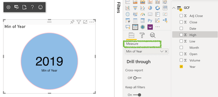
Now it looks better! Yep, I agree with you. It does is still quite basic, specially compared with the existing ones on Power BI. But hey, one step at time. Even those fancy charts went through the same stage as we are now 🙂
Adding Format Options
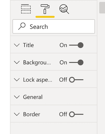
If we have a look at the Format tab of our new custom visual, we can find options such as title, border, and others.
I’m going to show you now how we can easily customize it. Let’s go back to our capabilities.json file and update the objects section as below:
{
    "dataRoles": [
      ...
    ],
    "objects": {
        "circle": {
            "displayName": "Circle",
            "properties": {
                "circleColor": {
                    "displayName": "Color",
                    "description": "The fill color of the circle.",
                    "type": {
                        "fill": {
                            "solid": {
                                "color": true
                            }
                        }
                    }
                },
                "circleThickness": {
                    "displayName": "Thickness",
                    "description": "The circle thickness.",
                    "type": {
                        "numeric": true
                    }
                }
            }
        }
    },
    "dataViewMappings": [
      ...
    ]
}
Now we overwrite the code on src/settings.ts with the one below. The objective is to create a new class (CircleSettings) to control the component settings, such as visual color and border thickness.
"use strict";

import { dataViewObjectsParser } from "powerbi-visuals-utils-dataviewutils";
import DataViewObjectsParser = dataViewObjectsParser.DataViewObjectsParser;

export class CircleSettings {
  public circleColor: string = "#007acc";
  public circleThickness: number = 3;
}

export class VisualSettings extends DataViewObjectsParser {
  public circle: CircleSettings = new CircleSettings();
}
By last (I promise), Below is the final version of our src/visual.ts file. Note the highlighted updated code where we are reading the settings from the src/settings.ts.
"use strict";
import "core-js/stable";
import ".../../assets/react-d3js-powerbi-part-one/style/visual.less";
import powerbi from "powerbi-visuals-api";
import IVisual = powerbi.extensibility.IVisual;
import VisualConstructorOptions = powerbi.extensibility.visual.VisualConstructorOptions;
import VisualUpdateOptions = powerbi.extensibility.visual.VisualUpdateOptions;
import EnumerateVisualObjectInstancesOptions = powerbi.EnumerateVisualObjectInstancesOptions;
import VisualObjectInstanceEnumeration = powerbi.VisualObjectInstanceEnumeration;
import IVisualHost = powerbi.extensibility.visual.IVisualHost;
import * as d3 from "d3";
type Selection<T extends d3.BaseType> = d3.Selection<T, any, any, any>;
import DataView = powerbi.DataView;
import { VisualSettings } from "../../assets/react-d3js-powerbi-part-one/settings";
export class Visual implements IVisual {
private host: IVisualHost;
private svg: Selection<SVGElement>;
private container: Selection<SVGElement>;
private circle: Selection<SVGElement>;
private textValue: Selection<SVGElement>;
private textLabel: Selection<SVGElement>;
private visualSettings: VisualSettings;
constructor(options: VisualConstructorOptions) {
this.svg = d3
.select(options.element)
.append("svg")
.classed("circleCard", true);
this.container = this.svg.append("g").classed("container", true);
this.circle = this.container.append("circle").classed("circle", true);
this.textValue = this.container.append("text").classed("textValue", true);
this.textLabel = this.container.append("text").classed("textLabel", true);
}
public enumerateObjectInstances(
options: EnumerateVisualObjectInstancesOptions
): VisualObjectInstanceEnumeration {
const settings: VisualSettings =
this.visualSettings || <VisualSettings>VisualSettings.getDefault();
return VisualSettings.enumerateObjectInstances(settings, options);
}
public update(options: VisualUpdateOptions) {
let dataView: DataView = options.dataViews[0];
let width: number = options.viewport.width;
let height: number = options.viewport.height;
this.svg.attr("width", width);
this.svg.attr("height", height);
let radius: number = Math.min(width, height) / 2.2;
this.visualSettings = VisualSettings.parse<VisualSettings>(dataView);
this.visualSettings.circle.circleThickness = Math.max(
0,
this.visualSettings.circle.circleThickness
);
this.visualSettings.circle.circleThickness = Math.min(
10,
this.visualSettings.circle.circleThickness
);
this.circle
.style("fill", this.visualSettings.circle.circleColor)
.style("fill-opacity", 0.5)
.style("stroke", "pink")
.style("stroke-width", this.visualSettings.circle.circleThickness)
.attr("r", radius)
.attr("cx", width / 2)
.attr("cy", height / 2);
let fontSizeValue: number = Math.min(width, height) / 5;
this.textValue
.text(<string>dataView.single.value)
.attr("x", "50%")
.attr("y", "50%")
.attr("dy", "0.35em")
.attr("text-anchor", "middle")
.style("font-size", fontSizeValue + "px");
let fontSizeLabel: number = fontSizeValue / 4;
this.textLabel
.text(dataView.metadata.columns[0].displayName)
.attr("x", "50%")
.attr("y", height / 2)
.attr("dy", fontSizeValue / 1.2)
.attr("text-anchor", "middle")
.style("font-size", fontSizeLabel + "px");
}
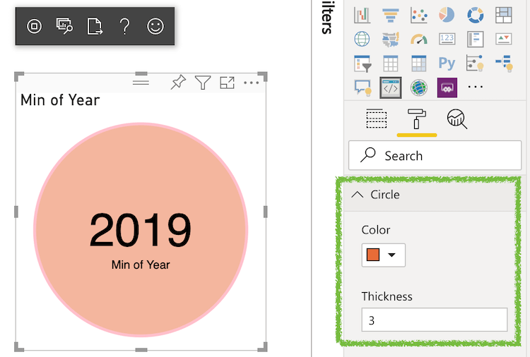
}Back to Power BI, a new format option called Circle should be available and enable us to customize color and border thickness:
That’s enough for part one, it is probably almost becoming too much to digest at once (sorry).
Let’s leave the rest for the second part of our post! (don’t need to worry, it is just a week away 👌)
Useful Resources
- Today’s Code on GitHub
- Power BI Developer Center
- Observable
- Power BI Custom Visuals Library
- Stack Overflow - Pbiviz Error
Update ⚡
Here is the second part of this post series, developers 💪
Conclusion
I’ve prepared some nice stuff for the second and last part of this subject, including React components, some cool visual styles and events, and how to pack a custom visual and share with our colleagues.
Congrats for getting to the end of the first part of this exercise. I admire your effort 👏
We can learn, do, and be anything we put our mind into. Remember, your only limit is your soul 💪
Stay tuned and remember to follow me on LinkedIn so you don’t miss any post!
See you on the next week, developers!
Follow Us
The Welcome, Developer has a brand new LinkedIn page! If you enjoy our content, we would be very happy to have you as a follower! In there, we will update you about new posts, new projects, and all the cool stuff!